Showing posts with label YCN. Show all posts

Monday, 10 February 2014

Final Poster


The final poster has the complete artwork with the coffee colour scheme and the redesigned logo to fit the theme. At this point I still felt like it was incomplete and decided to add a slogan using the CPB Script 2 font given to me in the branding guidelines, reading “Bringing your coffee shop home”. I used this for the slogan because the target audience has grown up with coffee shop culture so I think the phrase would really hit home to them. I then later decided to also give the whole image that canvas paper texture to really enhance the feel and the concept of an image painted with pure coffee.

Packaging re-design

I didn’t want to change too much of the original packaging design so I decided to keep all of the layout the same but redesign it stylisticly to see how the coffee painting style could apply to the logo and branding as well as the rest of the packaging style. I swapped the silver background for a light brown wash of brush strokes and faint splatters of dark brown and orangey brown hues. I’ve given the logo the matching colour scheme to the poster and given the shapes a stylistic brush stroke around the edges as well as textured the blocks of colours with coffee stain brushes in photoshop. I also swapped out the cup on the back of the packaging with the mug that is held by the figure in my poster so that there is a continuous style and connection between the two. Using photoshop I also edited the front of the package onto a tin to get and idea of how the design would look on packaging and containers and if it would appeal or stand out in stores.


1st Poster Progress


I started by doing the washy background with big water colour brushes and different hues of warm brown and orange colours, I also used a variety of splatter brushes on a lower opacity so they would look more like stains as they reveal the washy stroke behind them and also can layer up onto each other. Using the rough water colour painting I did of this design on a locked layer I started to make the outline with a black stroke using the pen tool on a separate layer above it. The final artwork won't have any outline so I am making this to use as a guide for my colouring and shading which could differ to the shape of the outline if I spot errors I want to change later with the shape of the colours. After finished the outline I locked the layer and made  new layer underneath and using the pen tool again I filled in the line art with my base colour which I will be shading on top of later. I then turned the preview off for the line art to get a basic idea of what it would look like without it, fixing any gaps between the shapes of colour which I couldn't see before. I've place the line art and colour for the hand and the mug on a separate layer in case I want to adjust the position or placement of the hand later as on the original sketch the mug was off centre which I didn't want.


I then started working on the shading of the neck and face using the line art as a guide but not following it completely as some parts of it were inaccurate to the look I was trying to create. I did my shading on a different layer to the base colours and I separated all the shading in different layer by sections or colours  so that I could easily make use of clipping masks and move them around if I needed to. I used my brushes on a very low opacity between 10% and 20% so that I can layer up the strokes and create a gradual change between the base colour, shading and highlights. When I am shading the strokes tend to go outside of the line art so I use clipping masks after in order to clean up the edges of the figure, making them look less messy.

  
When I finished the shading for the face I thought the head looked smaller in comparison to the body and looked slightly out of proportion Since I couldn't enlarge the size of the head due to the neck size being un changeable I decided to disguise it by enlarging the figure till the nose was cut out of the frame and the body took up most of the image, I also decided to add facial hair to give the jawline some slight extra width.


I then started working on the torso shading the grey vest with a big water colour brush on 30% opacity with a stroke between 6pt and 8pt. I used a bigger brush than I usually do to try and recreate the washy water colour style and defining the shape, form and creases of the jacket using only shadow and highlights and avoiding using any outlines. I then used the same technique, using big water colour brushes on low opacity to shade the rest of the torso such as the orange shirt and the tie all on separate layers, defining their shape with shadows and highlights.


On two separate layers I started doing the shading for the hand and the mug in the same washy water colour style using thick strokes of water colour brushes. I then also added a white swirly stroke on low opacity from the coffee to the face of the figure to look like steam or as if he's getting a whiff of the aroma. I also took the PDF of the artwork that was downloadable with the brief and thought it would look appropriate on the mug and also added some other part of the artwork from the packaging onto the poster such as little logos and symbols. The poster Is done at this point but I feel like something is missing such as typographic elements though I'm not sure how to use it so I will discuss it during crit feedback.

Coffee Painting Experiment


Here I have experimented with coffee paintings by using water and Nescafé gold granules on canvas paper. I have experimented this with a whole new design which I drew straight onto the canvas as an idea of a 3rd poster. I own't be making a third poster but I wanted to play with a design which would combine aspects of both of my first 2 posters, using the hands and the mugs of both of the figures from the posters and clinking their mugs together with the coffee slightly splashing out from the movement and the tweaked logo design in the background which matches with the coffee painting concept design for both the posters and the packaging. I have used dry and wet brushes and different concentrations of coffee to create different tones. I realise coffee is a little more tricky to paint with than water colour as it is quite sticky. I have also played with effects by splattering coffee and using the bottom of a mug to create coffee rings. I have also used a wet brush to create drips and a spray bottle or stained bloom effects.

Water colour experiments

Here I have done some rough experiments with water colour on canvas paper so I can get a sense of the  texture and style that the paper and paint creates. I played with using wet and dry brushes and canvas paper as well as splattering paint, dripping paint and using a water spray bottle to spread the colours and create blooming and bleeding effects.


These are my roughed out design ideas for both of my posters which I have drawn from my chosen rough sketch of the torso in the suit. I thought this concept in particular was easy to use to appeal to both genders as it can easily be used for a female counter part also. The experiment on the left became the rough final design for my potential second poster. I figured I would use the same perspective of the torso, hands and bottom half of the face to keep the visuals consistent between the two. I'm going to make a slight change by changing her clothing to a classier dress and replacing the cigarette in her hand with a fountain pen. I've decided on this because I concluded that a cigarette isn't very appropriate as smoking is very frown upon and society has become very anti smoking since the time cigarettes were created. A fountain pen would appear classier and has regal connotations with it which I think suits the target audience better.

Rough sketches


These are my first two rough sketches for my initial Ideas. For the first one I was intending to combine coffee painting style with water colour by doing the desk and the items on the desk in a colourful water colour style and then the canvas that is on the table was going to have a coffee style painting on it with a hand holding a paint brush trailing off the canvas. In the end I decided to scrap this idea as I decided to stick to just water colour style and I also wasn't sure how to relate the idea of a coffee painting to the product or how it related to the product being high quality and instant. The second one was going to be fully water colour but I also decided to scrap it because the design is too generic and stereotypical for coffee adverts and posters. The theme is also quite girly and more appealing to women which I don't want to do as the target audience is of both genders.


Here I did some extra rough poster designs this time appealing more towards men as my previous two posters were too girly. I'm likely going to be using the one on the left with just the mug and the suit, I may add in just the bottom half of the face up to the mouth and then if I have time for a second poster i'll re-sketch a female version of the same concept and perspective of just showing the torso, hands, chin, lips and a mug. The poster on the right is associated with the whole concept of time as indicated by the clock in the background and the person struggling to wake up in the morning with out his quick fix of coffee. I made the figure look tired and like he just got out of bed because it shows that the coffee is quick and easy to make and and doesn't take much time out of his routine to get ready for work.


This sketch shows a business man on the train on his way to work enjoying his coffee from a thermo container. I decided to make travel and business the theme of this one because my idea behind it was that even though he is possibly in a rush and on his way to work the coffee was still convenient and quick enough for him to enjoy on his train journey though he might not have had the time to drink it at home.

Tuesday, 4 February 2014

YCN Pitch

I explained my initial ideas and showed some rough sketches for my design ideas in my pitch. I started  with pin pointing the requirements of the Nescafé brief and what they are asking me to do for them.
I need to come up with a product innovation for them and think about creative solutions to ensure the consumer can access a high quality coffee, instantly. They want me to emphasise the high quality barista coffee as well as the fact that it can be made quickly to fit into their busy lives. I also have to create a social media campaign to launch the product innovation.


The creative requirements are to write an explanation of my idea in a summary fewer than 300 words and explain how my concept will appeal to consumers. I need to also show them my ideas visually with  mock ups sketched by hand, made on software or a combination of both.


My target audience is a young and dynamic consumer aged between 25-35 and they have grown up with coffee shop culture drinking higher quality coffee and looking for better quality experiences. They love the coffee they get from coffee shops and want to make the coffee at home in a convenient and affordable way.


I showed some examples of vintage Nescafé adverts and posters I was looking at since I want to create a vintage theme within my own posters to appeal to the generation my innovation is aimed at. I also showed some examples of Carol Gillot's water colour paintings and Georgeta Blanaru's and Josephine Ryan's coffee paintings and portraits.


An issue of discussion took place about whether I would do my posters in the water colour style or the coffee painting style as I can't do both even if the style are similar it is the colour schemes which differentiates them greatly. I initially wanted to try out the coffee painting style but since I though it would make more sense to use the colour scheme from the product itself I decided in the end to stick with the water colour texture/ style.


I then showed my chosen colour scheme which I had extracted from the product and the branding guidelines for Nesacafé Azera which was downloadable with the brief. They are very strict and specific about the typography I'm allowed to use which has to be the two shown below meaning I can't make any of my own stylistic typography. One of the ideas I had earlier of a typographically styled poster wouldn't have worked because of this.


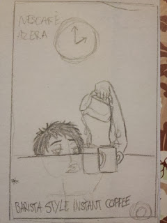
I then showed some of my rough sketches of my design ideas explaining where the colour scheme would take place and the style I was aiming for with each poster (before I decided I was going to stick with the water colour style). Another topic was discussed where my poster designs appeared too girly looking and appealed more to women, I hadn't realised this as this was not my intention and I noticed that it was indeed an error since I want my posters to appeal to both genders of a more mature nature and mind set rather than this feminine visual style.


I am going to work on doing some more rough sketches for poster designs to appeal more to men as well as some that look gender neutral. I'm also going to experiment with some watercolours using my chosen colour scheme and seeing which effects I can achieve on paper and if I can recreate them digitally.

Sunday, 2 February 2014

Other Coffee & Water colour Paintings

Here are some extra coffee paintings and water colours I found which I liked from unknown artists.


This coffee portrait is similar to Josephine Ryan's work only less detailed and less range of shades. There aren't any patterned elements like the swirls or splatter, drip and ring stain effects. This uses a washy style for both the background and the portrait which has messy edges where as Ryan's style uses more intricate and clean strokes for the portraits and the washy style for the background. Since there is less range of shades the contrast in this painting isn't very strong.


This image is similar to Georgeta Blanaru's style with cleaner and thicker lines and more contrasted shades of brown as well as lack of spill effects and splatters. The minimal design and background also resembles Blanaru's art style only there is a lack of theme outside of coffee itself such as music. The shape and movement of the pouring coffee is very exaggerated creating curves and rounded ends with a cartoon like appearance.


This water colour painting uses a dominantly brown, green and white colour scheme. The combination of brown and green are usually connotations of freshness as the colours are associated with nature giving a "freshly ground coffee" feel to the painting. There is the texture of the canvas paper which has been accompanied by a wooden style texture painted for the table using different densities of water colour and patterned lines and curves that repeat.

Friday, 31 January 2014

Georgeta Blanaru - Coffee Painting

I came across a painter Georgeta Blanaru. She is a self taught, talented artist in the classical field. She paints with watercolors, acrylics ,oils etc. as well as in the modern field of digital painting. She likes to explore new mediums for painting, in her quest she found what a great medium pure coffee is, when mixed with water.


She has done a series of coffee paintings with the theme of Jazz. The above painting is of a gramophone which is playing music (presumably jazz) and a box with a book on top. The background is of a white and reddish/brown checkered tile floor and a lightly stippled brown wall. The typography read 'Jazz' and the J overlaps the a and the word is written in a brush stroke style which varies in thickness. The warm colour scheme in relation to coffee gives the jazz theme extra enhancement as jazz has been commonly connoted with high quality coffee and coffee shops.


Here is another painting from her coffee jazz series of a man dressed in vintage clothing wearing a hat and shades whilst playing a double bass. There is part of a music score flowing behind him with the 5 lines and musical notes you see in sheet music. The same typography is used for the word Jazz again. The background has a washy style with blooms of darker and lighter shades of brown where the coffee is more or less concentrated. Unlike Josephine Ryan's work Blanaru doesn't make use of any splash, splatter, drip or ring stain techniques and instead keeps her strokes and shapes very clean and distinct.


This painting has more texture to it as it's been painted onto a canvas or canvas paper unlike the previous two which looked more like it was painted on regular paper. The lines for each petal of the lotus is dark and thick whilst the colour of the lotus petals itself are not much different to the background. The dark thick outline separates the tones and shading of the lotus petals from the background giving it a more definitive shape and form.


This next painting was also painted on canvas, given the texture. The style of this has a more washy fill making the water and the sky looks soft and gentle, resembling watercolour style paintings. She has worked well with inversion in this image as she has drawn two turtles facing each other that look the same, only one is draw with a dark outline and the other is drawn with a dark fill. The long dark grass in the foreground create a silhouette and depth of field and range within the image.

Josephine Ryan - Coffee Painting

I decided to look at some coffee painting artists as I came across some when looking at water colours and they look pretty similar except with colour differences due to one being painted only with coffee.
I found this artist I really like, Josephine Ryan who did a series of portraits painted with coffee.


This particular piece has elements of splattered coffee and drips which I might draw some inspiration from for my own posters as texture, using the artistic brushes in illustrator. The facial features of this piece are very detailed and close to a photo realism style, as the eye lashes and lines in the iris are very intricate and the shading on the lips are accurate to realism. She has also lightly used the splatter effect across the face of the portrait which creates the illusion of freckles.


This image is much darker in tone and the only space of white is her face, making it contrast against the darker background. She has used a lot of swirly elements do decorate the top and right side of the image like a border. The silhouettes of the butterfly and dragonfly are very intricate with the patterns in their wings. She has used a few splatters of coffee and added faint coffee rings, there is also much use of a stippling brush effect for most of the background.


This painting has a lighter tone than the previous one and uses the same swirly patterned elements as the darker one except they are inverted. I imagine her technique behind the white swirls was that she used masking fluid to paint the swirls on and then once dry she dripped and splattered coffee onto it, after the coffee dries the masking fluid can then be rubbed off creating the white swirls within the dark splashes of coffee. She has made much use of the coffee ring stain effect and the splatters from the background gently merge into the girl's hair.

Tuesday, 21 January 2014

Coffee Graphics & Illustrations

Here are just 3 more poster designs and illustrations I came across which I like with the theme of coffee. I thought it would be interesting to look at these as they all have a different style, colour scheme and approach to most coffee related adverts and posters.


This illustration uses a very different colour scheme compared to most illustrations where coffee is the main subject. Instead of using the usual brown and yellow hues there is a lot of green and mentions of teal and red. They have combined illustration with typography in this image making the text part of the art as it fits inside the shape of the figure's top. The typography is yellow, orange and off white with a curly typeface. The art style has no line art and is mostly made up of shapes of block colour with no shading or patterns, there is no textures used in this illustration besides the subtle coffee stains in the background. I think the slogan in this poster could appeal more to young adults, "drink coffee, do stupid things faster with more energy" has a sense of humor to it but I wouldn't imagine this appeals to the busy schedule of a middle aged target audience but more to students.


This poster is more in the style of a propaganda poster, where the message is bold, short and to the point. The dominant colours in this poster are blue and white and shadowing is soft and resembles a gradient style of shading. The typography is bold and has sharp corners and edges making the message sound more like a statement or an order. I really like the subtle use of the two coffee ring stains by the cup as this makes the poster look as if is has been on a desk as a print and someone who had been drinking coffee placed their mug onto the poster making the rings, I think this emphasises the message and intentions behind this poster more and the elements used are strong.


This poster takes a more heart warming approach with their slogan and imagery as they have illustrated the coffee beans to be heart shaped and the typography uses a heart for the 'o' in 'coffee'. The typography has a friendly look to it with it's rounded edges and heavy stroke combined with a hand written typeface. The colour scheme mainly consists of red, white and orange for the background, typography and product image, the red in the background adds to the heart warming feel and works with the heart shaped elements. 

Sunday, 19 January 2014

Modern Nescafé Posters & Adverts


I came across these very nice paris themed adverts promoting Nescafé Dolce Gusto. The art style for these are hand drawn and hand painted and feels as if the coffee was made for creative people. This gives me an idea for my own posters as I could use a slogan or particular imagery in each of the posters to reach out to a specific career path, i'll explain this further later. I like the idea of the graphic of the pen at the end of the typography as if someone wrote it by hand onto the paper, I want to use this similar idea for one of my posters but with a paintbrush and making the colours and style resemble as if it was painted with coffee. The posters have a canvas like texture to them making it feel more relevant to the arty theme. The coffee is seen from a bird's eye view and the logo is placed within the cup. There are elements within the posters which relate to paris and art such as the eiffel tower and the paint palette and the girl's sailor style dress.


I really like the look and feel of this one as it looks magical with it's swirly font and as if that tea cup with the golden contents spilling out is like a pot of gold. The emphasis on a sweeter coffee is made with the imagery as the cup itself is a milky brown colour and matte in texture making it look as if the cup is made out of chocolate itself and then over flowing with a golden, gooey, caramel over the sides and collecting at the bottom of the cup. The colour scheme is brown yellow and white and the font style is an elongated and curly script. The background is a gradient and starts with a dark brown at the edges and get lighter as it goes towards the centre behind the cup. The logo is placed at the top right corner of the poster whilst everything else is lined up in the centre of the page. This poster isn't over decorative as it's focal point is the text and the product so they've avoiding putting in any distracting elements.


In this advert they emphasise coffee as being a quick pick me up and that it fits into people's busy schedules. This is exaggerated by the slogan "Don't waste any second" and the face that that coffee steam forms the shape of an alarm clock. It's also emphasised by the fact that the product is tucked away and the bottom right corner of the poster and even cut off by the edges of the canvas, because they want to draw your attention more towards the time factor. The background uses a subtle gradient from sandy colour to a tan colour. I'm not keen on the font face as with coffee adverts including ones for nescafe i've always seen a more decorative or stylistic script font being used, which I think just works because the shape matches well with that of the steam that comes from coffee.


This is another poster consisting purely of typography though unlike the poster in one of my previous posts the words form the shape of the much as whole words and without being cut off at the edge of the cup. Instead the words have been warped, flipped and rotated to fit into the shape as a whole word rather than the shape being cut out of a wall of text. As usual the colour scheme consists of brown, beige and creme. The logo, mug and slogan are all centred leaving breathing space between the content and the edges of the poster. They are emphasising high quality coffee at home with the slogan "Enjoy quality moment in every day life".

Other Vintage Coffee Ads


Here are some other vintage coffee adverts I have found. These two posters somewhat remind me of propaganda posters with their humorous slogans. The colour scheme is minimal using only red, creme and black and the way the figures are illustrated is at the same angle showing only the face and a hand holding a cup of coffee. I think the black lines coming outwards from the figures emphasis alertness and how the coffee is keeping them awake, the slogan on the left poster emphasises this further by stating "You can sleep when you're dead!". The slogan on the right poster also emphasises alertness as it indicates the drinker is shaking from excitement, both figures also are drawn with their eyes wide open and smiles on their faces to show how animated they are.


This is another series of two vintage posters advertising Sanka Coffee. By doing a poster each for a female and a male consumer much like the previous two they are trying to appeal to both genders to drink the coffee. In these posters rather than the figures looking as if they've drunk the coffee they illustrated them to have smiles on their faces with their eyes close and hovering over the giant cups of coffee to look as if they are enjoying the smell of it. This imagery with the text underneath it is trying to sell the product with the point that it has a nice aroma which can be overwhelming with happiness. I think the reason why they have illustrated the cups to be bigger than the people is to help emphasis the slogan 'Indulge yourself...' almost as if it's telling you to literally swim in the coffee.


This is some vintage artwork I found of Americana coffee which depicts two cups of americana but at different perspectives, one is at a forward might height view and the other cup is place on top in bird's eye view with a spoon resting over it. I'm not sure what this is supposed to suggest or why they have done it this way but I find it unique. The background is made up of triangular and rectangular shapes in colours of grey, red, dark brown and yellow with some shades of orange/brown. The over all texture of the painting is grainy as if it was illustrated with a spray pen, making the shading soft and diffused.


This artwork has a very victorian theme to it and depicts two women in white frilly clothing enjoying coffee together at a cafe. The style of the image feels collage like to me as some imagery looks as if it was pasted on like the random square images of latte at the bottom corners of the image which overlap the women. The women themselves also look as if they were cut out of a magazine and pasted over the collaged background of random images of coffee and typography. A common colour theme I keep seeing within this piece is orange, beige/yellow and dark red.