Showing posts with label Penguin Book Cover Design. Show all posts

Tuesday, 8 January 2013

Cover Development - Spine and Back

I started making the spine in a new layer using mostly the pen tool to fill it in black and to create the red blood drops at the top. Back in the title layer I typed out the title along the spine as well as the author's name.

I then worked on the trace for my back cover in a different layer using the pen tool and tracing my sketch of the man in the chair from my sketchbook. I filled the chair in black and using some calligraphy artistic brushes I drew in the white smoke. I felt this was more effective for the smoke than using the pen tool as the curves didn't have any obvious anchor points in them. I also think that the lines blend better together as they have different thicknesses and the calligraphy brush doesn't have a set stroke.
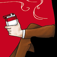
 
Using the pen tool again I went in and filled in the base colours of the suit, hat and hand on a separate layer. In that same layer I used artistic paint brushes with a 0.25 pt size and between 20 - 50% opacity to start adding some details to the hand and the pack of cigarettes giving them some highlights and shadows. I continued shading like this with the same brushes for the hat and suit as well.

Now I'm going to add the blurb to the back cover. The first part of it will be written at the top in the red space which will be a quote from the book which is included in the blurb. For this i'll be simply using the text tool and typing it out in my typewriter font face. I want the rest of the blurb on the back of the chair but I want the text to follow the shape of the chair. To do this I duplicated the chair layer and labelled it 'chair blurb', I then selected the fill shape of the chair and click on the path of the chair with the type tool, this made a text box in the shape of my chair's outline so I just continued to type in the rest of the blurb, making the reviews at the bottom in a grey colour to separate it from the blurb itself.

This is the finished product.

Monday, 7 January 2013

Cover Development - The Front


I started off by opening the penguin template in Illustrator onto an art board that I had already set the right size to. Using the ruler tool I then started to make guides to help me keep my design within the 5 mm bleed and to help me determine the space in which I should keep all my artwork in. I then locked both layers. I made a new layer and opened up Rene Gruau's painting 'Le bas Scandale' to use as my reference for the legs on the front of my poster. Locking that layer and making another one I used the pen tool to start outlining the legs and feet and also the pillows except making the pillows look more like a newspaper.
On a new layer using the pen tool again I started filling in the block colours which was mainly red black and white as well as the base of the skin colour. I also added in the line art of the ash tray and cigarette using the pen tool and using the rectangular tool I made the Polaroid snap shots on the floor. I change the shape and angle of them to make it look like they were laying on the floor by copy and pasting the same snap shot and use distortion to stretch and curve them into different positions/ angles to give it some perspective. Using the pen tool again I then coloured the ash tray.

Next I made a new layer for all of my text and added the title of the book to the front of the newspaper using the 'blockhead' font that I've chosen. I expanded the title and then un-grouped it, selecting the B in Big I deleted it as I didn't like the style of it for my title. I used the pen tool to re-create the B and then re-grouped the text. I then distorted it so that it would tilt as if with the page of the newspaper. I also added the author's name at the bottom in a typewriter font and used the pen tool to create the smoke of the cigarette.
I used the pen tool again to fill the shoes in black and the scroll brush to make the gray shading on it.
This is a close up of the shoes and ash tray.


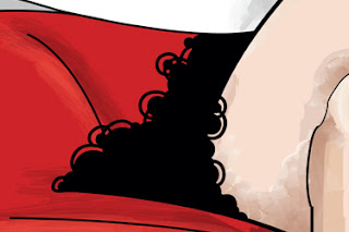
Next I started shading the legs using mostly water colour and paint brushes I also did some shading to the newspaper in a similar way. After shading the rest of the front cover such as the sofa and hands I went in with a round brush and started drawing the fluffy looking skirt of the girl making it look lacey with a small round bush that follows the curves of the skirt and adding smaller circles on the ends.

Saturday, 8 December 2012

The Pitch

My pitch came out pretty well, I showed a design that I drew in my sketchbook and got some feedback on it on how I could change it to make it better.

I started by showing a slide of bullet points for the main themes from the book that I should take into consideration when doing my design for the book's cover. I have talked about these themes in more depth in a previous blog entry but I just narrowed it down to the main ones I want to feature in my design for the book to keep it simple.


 I then showed them the mood board I drew up for existing book covers for The Big Sleep, and talked about which ones I liked  the most and why and if there were any elements from those that I would like to incorporate into my own design.

I then showed them a page about René Gruau which was the main artist that inspired my ideas for the cover and talked about the 3 themes I want to take from his artwork and feature strongly in my own design. Those themes were Legs, Femme Fatale and Elegance.

Moving on I showed them the sketches that I have done based on or inspired by René Gruau's work which I have also done a previous blog entry about. and talking about how I've changed some of them to look more original and where I could use them on the book cover.

I then showed some typography I was looking at and talked about which one I'm likely to use.
I quite like the Smoke Rasterized font as it has that fade/ gradient towards the top, Smoke screen is basically the same font as smoke rasterized except much heavier and bolder. I will probably go for the Blockhead font as it looks the most similar to the hand drawn font I did on my design, If it doesn't work I'll hand draw the font or maybe use blockhead and hand draw specific letters to make it look more similar to my hand drawn font. For the blurb and any other text I want to use a typewriter or maybe handwritten kind of font.
I then talked about my chosen colour scheme which is just black, white, blood red and grey.
 It turned out that on my design I have made the spine too thick, and that the design I did for the spine wouldn't work for the actual book cover as the spine was too thin and wouldn't fit my design of Vivian with the bloody orchid on it. I'm thinking about removing Vivian and the orchid completely, and just having the blood drop that comes from the bottom of the orchid and putting it at the top of the spine, and rearranging the layout of the text.
Someone also mentioned that on the front cover the pillows that the woman is holding looks like a newspaper, I thought that her holding a news paper would fit a lot better than pillows so I'm going to try and make them look more like a newspaper when I re-design this. I've also thought about removing the revolver because I thought it was too cliche and that the cigarette ash tray and the little Polaroid photos were enough.
For the blurb I was suggesting changing Marlowe's suit to brown and the background to red and everyone seemed to agree with this idea more than the one shown with the red suit and white background. They also suggested to change the smoke to white instead of blueish- gray as it would look better on the red background.

Tuesday, 4 December 2012

Rene Gruau

I have been looking at an artist called René Gruau. René Gruau loves women. With great humour, he defines Glamour and Sensuality by revealing the feminine universe, made of luxury, frivolity, futility and narcissism as the most natural thing in the world.

In the big sleep it is also obvious that Marlowe's attention is captured by most of the female characters who attempt to seduce him. You also notice his slight obsession with women's legs as he is very observative of them and often describes the legs of a woman he is talking to and compares them with each other's.


I might possibly have a theme of legs going on with my book cover but I'm not sure yet. Maybe i'll have a pair of legs going down the spine of the book, so I looked at the several drawings of legs by Rene Gruau. I also quite like the femme fatale and elegance theme which goes on throughout the book and Gruau has also done a lot of paintings and prints portraying femme fatale. I drew up two moods boards of his work which I thought could inspire my designs the most.
I then took my favorite images which I thought I could develope some sketches from that relate to my design.

Here I did a quick sketch of these legs that Rene Gruau painted as I thought that the pillow the woman was holding would be a good place to put the blurb. I also like the curves used in the image created by the legs which look very elegant and draw your eyes down to the ankles where you then noticed that one of her shoes is falling off which can look very cheeky and seductive. This image reminds me a little of pin-up or show girls from the 1940's era of Los angeles. The colour red features strongly in this painting as it connotes with passion, seduction and blood which is one of the main themes throughout the book. The Black white and red scheme create contrast and the fact that the legs are painted using skin colours give it a sense of life and sexual temptation.

In this sketch I have made changes from the original image by changing the ball of netting in the middle to look like a bloody orchid instead. I have made the woman look more like the character Vivian Regan from the book as she is the most elegant of the femme fatale characters, and it is said that orchids represent beauty and luxury. I have decided to make the orchid bloody because the two petals on the left and right side look similar to lungs, and in the book old man Sternwood (Carmen and Vivian's father) has some sort of lung cancer.
For this sketch I have clothed the male figure in a suit and I have tried to make it resemble Marlowe. I have also added a pack of cigarettes to his hand and a silhouette oh his hat on the top right edge of the chair. After doing this I though that it was probably a bad idea to make the hat into a silhouette and that it should actually match with Marlowe's suit so that it looks like a separate object rather than a part of the chair. This was another idea for the blurb of the book though I might Flip this image so that it corresponds well with the front cover which I have decided I might use the first pair of legs I drew for. I like the original image because the figure of the person in the chair looks relaxed which I thought could easily be associated with Marlowe after a case closed. I also like the fact that it hides the face and identity of the person in the chair so that the person reading the book can relate to the character more and easily put themselves into Marlowe's shoes.


Tuesday, 27 November 2012

The Big Sleep

I have decided to do a book cover design for The Big Sleep as I thought the theme for it was darker and more interesting than The Wind in the Willows. I thought it might end up more of a challenge to come up with design ideas for an outdated crime novel which is aimed at a more mature audience than it would be to design a book cover for children.

Themes within the book that should be considered when designing.

Femme Fatale - Most of the female characters in this book seem pretty batty and get up to no good. They also all seem to try and seduce Marlowe in some way probably to take him off his game. While Marlowe does take a fancy to these female characters he tries not to get too involved and doesn't allow himself to get distracted. I think Carmen is the main problem of these female characters. She snoops around a lot and Marlowe always tends to find her in odd situations, she also often acts rashly or does something stupid (like shooting Joe Brody).

Orchids - Have been mentioned every now and then in the book and appears quite symbolic. I have looked up what orchids symbolise and it turns out that they indicated luxury, beauty and elegance. I think the orchids are very symbolic to the femme fatale character in the book, especially Vivian Regan as she is a rather wealthy, elegant and beautiful woman.

Cigarettes/ Cigars - There appears to be a common theme with the characters smoking cigarettes all the time or sometimes cigars as in that era smoking was very common. I think smoke could also be quite a cool effect for the design such as the title font.

Coffee - Marlowe tends to drink coffee a lot in the morning. I remember a scene where he said he had two cups of coffee while working at his desk. I think coffee could also work quite well within the design. by either using coffee colours or subtle effects such a coffee rings and stains.

Rain - It rains quite often in the book. Usually when Marlowe is in deep thought about the situation he's come across, or when something bad is about to happen, such as in the start of the book after he went to go see Mr Sternwood or when he was sitting in his car outside Geiger's shop.

Gambling/ Roulette/ Alcohol - Part of the corruption the city is under. There have been several scenes where Marlowe is drinking, such as when he first meets Mr Sternwood and Vivian Regan. He also seems to keep a bottle of Whisky or some other kind of alcoholic beverage in his car. Vivian has mentioned that she likes Roulette.

Legs - In the book Marlowe observes women's legs often and tends to describe them or talk about how he likes them. I thought using legs might be quite interesting to use as a design concept such as using them on the spine or maybe as part of the back cover.

Crime/ Murder/ Guns - This is a strong theme within in the book and many detective novels in fact. There are about 3-4 murders in the book so far (from where I've read up to) and many of the characters are usually in possession of firearms/ revolvers.

Monday, 12 November 2012

Penguin Book Cover Design - The Brief

Design a Penguin Adult or Puffin children's book cover following The Penguin Design Award competition brief. Adapt the design into an A2 poster, advertising the re-launch of the book.

Adult's book: The Big Sleep

Audience: all readers both familiar and unfamiliar with the text, male and female.
Message: there are many layers and themes within the book. Read it and discover what the book means to you. 
The winning design will need to:
  • have an imaginative concept and original interpretation of the brief
  • be competently executed with strong use of typography
  • appeal to a contemporary readership
  • show a good understanding of the marketplace
  • have a point of difference from the many other book covers it is competing against


Children's book: The Wind in the Willows.
First published in 1908, and inhabited by anthropomorphic creatures with quintessential English charm, The Wind in the Willows possesses a wonderful fascination for children of all ages. Reinvent this classic for a new generation of readers, encouraging children (and adults) to revisit it time and time again, and ensuring that it remains an integral part of childhood.


The winning design will need to:
  • have an imaginative concept and original interpretation of the brief
  • be competently executed with strong use of typography
  • appeal to the broadest possible audience for the book
  • show a good understanding of the marketplace
  • have a point of difference from the many other book covers it is competing against
  • be able to sit on the shelves of a supermarket or ebook store as easily as it sits on those of more traditional bookshops such as Waterstones


Design a striking book cover that is well executed, has an imaginative concept, strong use of typography and clearly places the book for its market.
The front cover needs to be effective on it's own and be eye-catching so that it stands out in a crowded book shop as well as on screen for online retailers such as Amazon.