I started off by opening the penguin template in Illustrator onto an art board that I had already set the right size to. Using the ruler tool I then started to make guides to help me keep my design within the 5 mm bleed and to help me determine the space in which I should keep all my artwork in. I then locked both layers. I made a new layer and opened up Rene Gruau's painting 'Le bas Scandale' to use as my reference for the legs on the front of my poster. Locking that layer and making another one I used the pen tool to start outlining the legs and feet and also the pillows except making the pillows look more like a newspaper.
On a new layer using the pen tool again I started filling in the block colours which was mainly red black and white as well as the base of the skin colour. I also added in the line art of the ash tray and cigarette using the pen tool and using the rectangular tool I made the Polaroid snap shots on the floor. I change the shape and angle of them to make it look like they were laying on the floor by copy and pasting the same snap shot and use distortion to stretch and curve them into different positions/ angles to give it some perspective. Using the pen tool again I then coloured the ash tray.
Next I made a new layer for all of my text and added the title of the book to the front of the newspaper using the 'blockhead' font that I've chosen. I expanded the title and then un-grouped it, selecting the B in Big I deleted it as I didn't like the style of it for my title. I used the pen tool to re-create the B and then re-grouped the text. I then distorted it so that it would tilt as if with the page of the newspaper. I also added the author's name at the bottom in a typewriter font and used the pen tool to create the smoke of the cigarette.
I used the pen tool again to fill the shoes in black and the scroll brush to make the gray shading on it.
This is a close up of the shoes and ash tray.

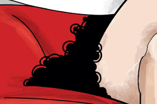
Next I started shading the legs using mostly water colour and paint brushes I also did some shading to the newspaper in a similar way. After shading the rest of the front cover such as the sofa and hands I went in with a round brush and started drawing the fluffy looking skirt of the girl making it look lacey with a small round bush that follows the curves of the skirt and adding smaller circles on the ends.
Next I made a new layer for all of my text and added the title of the book to the front of the newspaper using the 'blockhead' font that I've chosen. I expanded the title and then un-grouped it, selecting the B in Big I deleted it as I didn't like the style of it for my title. I used the pen tool to re-create the B and then re-grouped the text. I then distorted it so that it would tilt as if with the page of the newspaper. I also added the author's name at the bottom in a typewriter font and used the pen tool to create the smoke of the cigarette.
I used the pen tool again to fill the shoes in black and the scroll brush to make the gray shading on it.
This is a close up of the shoes and ash tray.

Next I started shading the legs using mostly water colour and paint brushes I also did some shading to the newspaper in a similar way. After shading the rest of the front cover such as the sofa and hands I went in with a round brush and started drawing the fluffy looking skirt of the girl making it look lacey with a small round bush that follows the curves of the skirt and adding smaller circles on the ends.


No comments:
Post a Comment