Showing posts with label Drinks Promotion. Show all posts

Monday, 13 January 2014

Inspiration - Game apps

Fruit Ninja
I decided to look at fruit ninja which is heavily controlsd by the swiping action, as i initially thought about making my game ap similar to fruit ninja except instead of slicing fruit you would be slicing beer cans and bottles. I later realised that broken glass and bottles wasn't appropriate imagery or graphics for anything promoting an alcohol brands as it is usually associated with danger and drunken behaviour.


Here is the main menu for fruit ninja the logo for the game uses a bright colour scheme to relate to the colourful fruits in the game, they have use purple, yellow, red and green which are all complementary colours. The background texture is of dadk planks of wood which have cuts and grooves in them and looks like a worn down chopping board. To select each of the options you have to slice the fruit using the swiping motion.


The aim of the game is to gain as many points as you can by slicing the fruit and trying to achieve a new record of points each game. The three x's at the top right corner of the screen are your lives, if you miss a fruit you lose a life. The difficulty increases as more fruit are tossed up and bombs are also thrown in which you have to avoid, if you hit a bomb it's game over and you will have to start again with your points and lives reset. Extra points are earned if you can slice more than 2 fruit with one swipe creating combos.


The sound effects in this game include the wind or slice effect of the sword swinging and the splicing of the fruit and the juice splashing on the backdrop. There is also sound effects for the bombs that fly up with the fuse crackling and also a sound effect for when the bomb explodes.

Dumb Ways to Die

This game was made based off of the Dumb Ways to Die animation for railway safety and much like wario ware consists of random mini games where you have to make use of a variety of  actions for each game.


In this particular one as it says in the screen shot you have to tapp the screen as fast as you can to run and put out the fire which is burning the character. You can pause this game and it also has a timer for each game which is the bar at the top of the screen which fills up.


This mini game uses a new interactive feature which I didn't even know was possible with a phone as the feature is quite similar to that of Nintendo DS consoles. You have to blow into the mic to keep the plane flying or you'll crash an lose a life.


The game does also have a life feature where the character has 3 lives and loses each one if a game is lost. The graphics for the lives are of 3 characters dancing with what looks like money, once you lose a life one of the characters remaining will fall backwards into a pit and a grave will pop up indicating how many lives you've lost and how many you have left.


Each time you collect a certain amount of points a new character is added to the train station on the home menu screen and there will be a bubble that pops up telling you how many more points you need to earn in order to unlock the next character. You can't do anything special with the characters you unlock, I imagine they're just there to drive some sort of motivation to play the game.

Noty & Moky

Very much like wario ware this game ap shows a screen with direction and instructions on how to play the mini game before it pops up, like in this one is shows a phone which i would assume you lay on a soft surface like your hand and a finger tapping the edge of the screen/phone.


The game is pausable but there doesn't seem to be any visible time limit. I may use the idea behind this mini game to inspire one of my own mini games as the whole thing is inspired by japanese culture, there is a game children tend to play where you fold paper sumos and make a little paper platform for them with a circle and you would have to tap the platform to knock over the other person's sumo.


For this one you have to use the pinch action to control the chopsticks and pick up the sushi off the conveyor belt and then swipe the sushi to the plate. There seems to be a time limit but it's not visible which isn't very useful.


Sunday, 12 January 2014

Inspiration - Other games

These are two other games which inspire me, similar to the app ones I looked at except on a different platform such as Nintendo Wii and Playstation 1. Both of these game also consist of quick mini games that are thrown at you at random and you have to complete each on to progress, if you lose in a mini game then you also lose a life. Both of the games have a bright and vivid colour scheme and have a crazy theme to them with very weird and surreal animation and imagery.

Wario Ware: Smooth Moves


In this game they teach you all of the positions and poses that you have to hold the wii remote in before the game itself pops up. For this particular one you need to clutch the wii remote in your hand and put your hands on your hips and then move your hips as if you were hula hooping. Each mini game also has a time limit as indicated at the bottom of the screen where these is a bomb in the bottom left corner and the fuse is getting shorter and shorter, either you would not do anything and the bomb would go off  and you'd lose a life for not knowing what to do or you'd start the action and either drop the hoop or win depending on how consistent your movements are. There are various poses to do for this game but for my app I will have to minimise my variety of actions or games to just ones where you can tap, swipe, or pinch etc.


The same concept pretty much follows through the entire game where they will show you the pose first so you are prepared and then a random mini game associated with that pose will start. In this one you place the remote on your palm facing upwards and you have to balance the broom on your hand and try not to drop it. I may use the idea of a time limit for my game and put something like a bomb or a ticking  clock somewhere on the screen so that it can cause the player to feel a little panicked. I'm also going to put the lives idea into my gave and give the player 4 lives which they will have to try and keep or will end up losing. I am still unsure of what to offer as a reward though for completing each stage or series of mini games.

Bishi Bashi Special


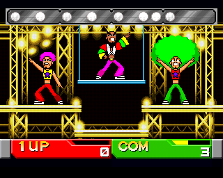
This game is rather old and is on the Playstation one so there is no touch screen or remote sensor features therefore all of the game play with done with a controller and there is more variety on instructions and buttons to press to complete each game. The controls in this game are usual easily to follow though without explanation as they are commonly either colour co-ordination to the buttons or distinguished with directions according to where on the game pad the buttons are place e.g. square is left, X is middle and circle is right, or triangle is green, X is blue and circle is red. In this mini game the controls are very simple it's just pressing one button but you have to press it in time with the beat of the leader. Each time you pressed the button correctly along with the beat your afro grows bigger. This is a 2 player game and whoever ends up with the bigger afro by the time the time runs out is the winner and the other person loses a life.


This game is colour co-ordinated and you have to press the buttons of the colours of the beans in the order that they fly up. When you do this correctly the character eats the beans without missing any and you gain point. Each time more beans are added and they pop up quicker so it become easier to lose your concentration with all these blobs of colours flying around, if you mis press a button and get the order of the colours wrong the character gets hit in the face by the beans and drops them all. By the end of the time limit the winner is the person who ate more beans.

Japanese Landscape Prints - Katsushika Hokusai.

Lanscape painting has a long tradition in East Asian art. Landscape was not an important feature of Japanese woodblock prints until the early 1800s. by this time, Japanese citizens were taking part in more outdoor sight seeing activities, such as festivals, temple visits and boat trips, and there was a growing demans for souvenir images. In the competitive world of the publishing industry, publishers were constantly trying to develop new products, and landscape prints were a novelty.


The Great Wave off Kanagawa is a very well known print painted by Katsushika Hokusai between 1829 -32 in the late Edo period as the first print in Hokusai's series Thirty-six views of Mount Fuji. This landscape print is one of his most famous works, and one of the best recognised works of Japanese art in the world. It depicts a huge wave threatening boats off the coast of the prefecture o Kanagawa. On many occasions the wave is assumed to be a tsunami when in fact it is as the title suggests, more likely to be a large wave of the open sea.
  Thirty-six views of Mount Fuji in an ukiyo-e series of large, colour woodblock prints by Hokusai. The series focuses around images of Mount Fuji in differing seasons and weather conditions from a variety of different places and distances, and the mountain itself appears in the background. It consists of 46 prints created between 1826 and 1833. The first 36 were included in the original publication and due to their popularity, ten more prints were added after the original publication.


Fine Wind, Clear Morning is another wood block print by hokusai which is also part of his Thirty-six views of Mount Fuji series. In early autumn, when the wind is southerly and the sky is clear, the rising sun can turn Mount Fuji red. Hokusai captures this moment very precisely in time with the composition and the three shades of deepening blue of the sky mirror the three hues of the mountain. Mt. Fuji's solidly symmetrical shape on the right half of the image is balance by the delicate clouds on the left, creating a harmonious composition. I find that the red and green of the mountain and the forest sit well together as they are complimentary colours to each other and the blend works well. The blue of the sky next to the red feels like more of a clash but It works well with this image as it is vibrant and also shows  up strongly as the setting sun is beaming brightly against the mountain and the sky remains calmly blue behind it and also appears more vast because the colours appear stronger next to each other.


This image depicts a much more mundane location, a path that weaves through a marsh. The silhouette of  Mt Fuji is drawn with a single line, providing a backdrop for the figures and foliage battling the wind in the foreground. Bending their bodies and clutching at scarves and hats, all turn their faces away from the viewer as if they were the source of the strong wind that carries off the paper that the woman's kimono had tucked away. The papers are blown skyward, with some dancing leaves and an escaped hat. The wearer of the hat's gestures are that of surprise, a circle of padding is left pitifully on his head. The colours in this image feel very fresh and make the scenery look cold and as if the blowing wind is cold as white and shades of icy blue are dominant within this piece. the figures are wearing dark blue and brown which to me indicates warmer colours and possible indicates that the figures are trying to wear attire suitable to fight off cold winds and weather.


Inume pass in the Kai province is another part of the series which depicts a view of Mt Fuji from the hillside of Inume Pass. On the gentle slope at the left, two travellers walk in front of two horses carrying cargo. Ahead of them are two more men climbing the steep hill, Fuji surrounded by heavy fog at the base, looms against the yellow sky. In the foreground, travellers ascend Inume Pass and the small figures are seen from a distance, making the focal point of the composition the peak of Mount Fuji. The volcano rises through the thick layer of fog, changing to brown and then blue before reaching the snow-capped summit. The green and yellow rolling hills of the pass on the right provide a counterbalance to the form of the mountain placed slightly off-center to the left.

Japanese Pop Art - Ippei Gyoubu

Ippei Gyoubu is a japan based artist who has collaborated with Sony, Coca-cola, Playstation, Sega, Konami, Lotte and Disney to name a few. Each of his illustrations depicts a distinctive main character. After seeing some of his work I feel like most of it is heavily concentrated on the Japanese fashion and pop culture as he has done illustrations and collaborations with fashion brands and names such as Adidas and Nike and many of his characters are always wearing fashionable and sometimes quirky, unusual outfits and hairstyles. A lot of his work is in a long horizontal orientation almost as if it were a panorama shot and usually the setting is a very common scenery in japan such as the buildings of Shibuya in the back ground or inside of a train carriage or a fast food joint. It's the design of the characters and odd colour schemes and use of colour which make the image look very irregular despite the very normal scenery.


This image above is set in Shibuya and has a panoramic orientation. The main character is clearly the girl in red plaid print clothing as she is placed the closest to the foreground as well as the girl eating noodles. The girl in the red has a very normal colour scheme compared to the other characters as she has fair skin and a natural hair colour and eye colours such as brown and blue where as the other characters look un ordinary with their alien- like yellow, green and red skin colours and unnatural neon hair colours. I think the characters are made this way to show the diversity of fashion and style in japan and mainly in Shibuya which is the setting as Shibuya is associated as the fashion district of Tokyo along side Harajuku. I think this also associates with how other people who are unfamiliar with japanese pop culture may view all things from japan as outrageous, crazy and downright weird. I have noticed in some of his work including this one it feels as if he has illustrated a blur between a digital dimension and reality as some of the characters have hair that looks pixellated whilst others have more realistic hair shapes and a lot of these characters also have a semi futuristic design to show that japan is a very digitised country. I find the lines in his work very crisp, fine and precise. His style doesn't ever consist of sketchy or sloppily drawn or texture line art and he also uses red sometimes as the colour for some of his line art like other anime influenced work i've scene which I am considering doing for my own artwork in my animation. Similar to the super flat art style he doesn't use any shading in his characters and only colours them with flat planes of block colours, he sometimes uses textures or patterns such as polka dots or plaid but he doesn't shade and the hair of his characters are line less also and are formed with just a single colour in the shape of the hairstyle without any lines to define the strands or shape of the hair.


This image uses an interesting mix of media and material as the background is mainly made up of photographed objects unlike the first image I talked about whilst the characters still maintain their 2D anime influenced style. The 'sky' in the background is a white and yellow diagonal striped pattern which i find is more effective than making the background completely photo realistic as it showed the blur again between realism and cartoon and makes the image look more like a collage. I think the photo realistic background makes the image more interesting as i think photographed objects makes nature scenes, temples and religious structures look more authentic and natural than a drawing of it would which is appropriate for the setting. The 2D characters in the foreground make the image and scenery look more like a combination of modern era and historical era but I also think that it represents the fact that even in today's modern and digitised world there are still remains of historical culture and traditions which are still being practiced, appreciated and are useful to this day. All of the characters in this image are female and most are wearing the same japanese sailor school uniform though the characters still differ drastically and are individually distinguishable despite wearing the same uniforms because of the unnatural skin and hair colours as well as having noticeable features such as the girl with striped socks and the girl with robot like legs. He has also used a complimentary colour scheme for some of his characters such as the girl with yellow skin and purple hair and the two girls on the right placed next to each other as their hair colours, red and green compliment each other.


I really like this illustration as he went for something different to what he usually does with his panoramic city setting and fashionable, modern character designs. The orientation is landscape and he has used a more minimal colour scheme using colours which are representative of japan, red and white as well as blue and black. He has also used a texture as well as a flat pattern for the skin and clothing of the character and rather than multiple characters he has decided to focus it on one. Instead of his usual modern imagery he has drawn a traditionally fashioned geisha smoking from a pipe with regular black hair and he has used a knitted like texture for her skin with red and white stripes, colours representative to the japanese flag. For the background he has used a dark blue for the sky and white to form clouds and smoke behind the geisha and coming from her mouth, he has also used the white to draw 3 planes flying across the sky. The planes look like battle or war planes and the way the red is being used also indicate to me a state or war and conflict although the geisha has a relaxed expression I feel like it says she is at peace with herself and her lifestyle despite the conflict around her. I find the proportion of the character slightly off though as her hand is far too big in comparison to her face so it looks out of place to me. The round red adornment in her hair also reminds me of the japanese flag and I feel like this image in general has a very prideful theme to it which is mainly portrayed by the colours and the posture of the geisha.


This image is obviously a piece he did for adidas as there is product/ brand placement within the image as the Adidas logo is on the trousers of the robot looking character. The image is of square orientation and I feel like the characters are more influence by western pop culture this time round as the robot character wearing the green adidas pants closely resembles Guy a member of Daft Punk, a band of 2 robot like characters. The colour scheme is also very minimal with only 4 colours, pink, green, white and black. The colours here work well together as they contrast and compliment each other and it gives the image a very neon, nightlife kind of city theme. The background is plain and is white with only some pink over lapping circles in one corner to create some sort of pattern so there is no specific setting for this image letting the focus be completely on the attire of the characters. I have also noticed a single object which is a completely random yellow colour which isn't found anywhere else in the image making the yellow bag stand out. There is a square object inside the bag which I would assume is a CD that has been newly bought by the character and I feel it relates to the other characters in the image which have robotic features and are wearing headphones or have wires hanging off of them. This again emphasises the digitised community which has become a reoccurring theme throughout Ippei's work and has influenced him greatly.

Monday, 6 January 2014

Japanese Pop Art - Yumiko Kayukawa

I came across this japanese pop artist which I found whilst looking up japanese pop art who's work I really like and is strongly cultural. She uses repetitive themes and elements in her work which looks very pattern like and I have also found some art by her which I think also have elements or pay homage to historical japanese print art. Yumiko Kayukawa grew up in the small town of Naie in Hokkaido, Japan. She found her love of animals and nature in this pristine, natural surroundings which later became a consistent theme throughout her work. As she grew up, Kayukawa drew inspiration from American pop culture such as Rock & Roll, films and fashion. These influences are fused with modern and traditional japanese motifs to create her unique style. Kayukawa's debut as an artist was with a manga feature when she was only 16. She later attended and graduated from Bisen Art School in Sapporo, Japan.

As I was going through her work I noticed that the background in the illustration on the left looked incredibly familiar to me. I had seen it before when researching historical japanese print work and came across a painting of mt.fuji which looks exactly the same. From this I can see that this piece of work of hers is clearly paying homage to the original print and she has adapted it to her own personal style by adding in illustrations of animals and nature and of a young girl in the foreground of the image, as well as adding a floral frame and the background to make it look as if she were looking out of a window at the mountain or as if she was about to go into the painting itself of the mountain whilst looking back. I like how the most foreground objects are outline less and only have one colour such as the grass and plants. It's simple and the style is very representative of japanese art. Kayukawa commonly draws japanese women in her art with oriental eyes, black hair and blushed cheeks, she rarely draws men though some of her art does include male figures and she never draws foreigners with western features even though she draws inspiration from the american pop culture. Each of her works always have a repetitive theme within them also for example this one has flowers that are repeated to create the corners of the border, other examples of repetition i've seen in her work is birds, flowers or fruit and food. The colour scheme feels very autumn and warm and the contrast of the red mountain against the blue sky is very strong and vibrant and works well with the brown and musty green shades of objects in the foreground.


This image reminds me of the historical print with the big wave or tsunami with the little boats as the hair of the woman uses shapes and lines which are similar to the original print. I find it interesting how the hair of the woman forms into a vigorous wave and there are small objects floating atop it like a ship, barrels, lanterns etc. much like in the original wave print. I like how she has also again made it into her one personal style by adding floral elements and imagery of animals and a woman as the main focus. I think the black and the teal of the hair/ waves work well and it looks very refined and makes the woman appear sophisticated, I looked up symbolism of colours previously and black and teal both are connotations of sophistication. I also think the simple beige background works well as it doesn't draw attention away from the detail of the hair and with the flowers and the whale it looks very calm and not too busy or over crowded. 

This illustration uses a complementary colour scheme with red and green which are opposites on the colour wheel making the colours stand out against each other but not in a clashy way. I think the way this image is composed reminds me somewhat of a japanese movie poster or front cover for a book or dvd case, with the title going down the middle of the gap between the row of trees. The text feels subtle and isn't too bold and stand out-ish which I think works well with the tranquil theme that the green bamboo trees create. The image somewhat reminds me of the jungle book with the green scenery and the girl wearing red just like the main character of jungle book and the image of the monkey peeping out from behind the trees. As much as i like the complementary colour scheme I won't be using complementary colours for my own work. Red and green are also festive colours and red symbolises happiness (only in japan) whilst green is a connotation of nature and youth which I find relevant to the image as the japanese characters translate to 'bamboo child' and children are associated with youth.
Usually Kayukawa uses a complementary colour scheme for many of her pieces but in this one she has changed it up by using a neon colour scheme which looks much brighter and vibrant. In this image she is using a repetition of birds all in the same angle and pose but with different colours and patterns and hasn't used any floral imagery in this piece like she commonly does through out her work. The prominent colour of the birds is yellow and she has used this for the colour of the girl's clothes and telephone also so that she can sit comfortably among the birds in the composition. The blending between 2 colours in the birds and the blue sky in the background merge together in a fluffy or spongey kind of texture where the colours meet. The title of this image which is also what the characters in the image translate to is "Wild Bird", the image in general with the title give off a tropical vibe. I feel like most of the titles of her pieces are very literal in relation to the content of the illustration.

Japanese Pop Art - Takashi Murakami

Born and raised in Tokyo, Japan and internationally prolific as a contemporary Japanese artist, he works in fine arts media such as painting and sculpture as well as what is conventionally considered commercial media; fashion, merchandise, and animation and it known for blurring the line between high and low arts. He invented the term 'superflat', which describes both the aesthetic characteristics of the Japanese artistic tradition and the nature of post-war Japanese culture and society. Superflat is also used to describe Murakami's own artistic style and that of other Japanese artists he has influenced. From early on, he was enthusiastic about animation and manga, and aspired to one day work in the animation industry. He attended Tokyo University of the Arts, originally looking to acquire the drafting skills necessary to become an animator. Eventually he majored in Nihonga, the 'traditional' style of Japanese painting that incorporates traditional Japanese artistic Conventions, techniques and subjects.


Some of my favourite prints by Takashi Murakami are his flower and skull prints because the busyness in them is what inspires the style I want to try and achieve in some parts of my promo and app. I also really like the colour scheme in this print because they're vibrant and use mostly blue shades which is pretty much the same colour palette I was aiming to go for, with just a few stand out-ish colours used in certain areas such as pink yellow or green. I also like how some of the outlines for objects have an inverted effect or a double stroke line as it slightly separates foreground and background objects gives it a bit of a sense of depth yet still acquires that 'superflat' or flat print style. I also like how he's made it look so over crowded that objects and characters are even being cut off on the sides of the image because they don't fit in the image. Since most of his work are printed and look very patterned I might use simpler versions of his work as patterns for some of my artwork for example the print on the kimono of the geisha character could have this flower and skull pattern.

  
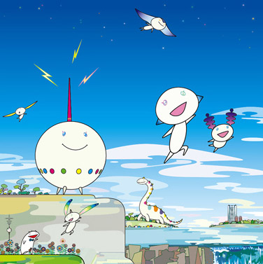
Some of his other prints that I like and that inspire me are his square superflat prints which usually show off some weird and simple character design and fresh looking blue landscape or the patterned happy flowers iconic to Murakami's style. He also commonly creates a camo-print like pattern to colour many of his backgrounds, landscapes and characters. He also draws himself in a lot of these square prints in an anime style. Most of these square prints are made up of different faces or expressions of characters such as the smiling flowers and different expressions drawn on his own cartoon self and other weird characters in the print. Supeflat is characterised by flay planes of colour and graphic images involving a character style derived from anime and manga. The theory posits that there is a legacy of flat, 2 dimensional imagery which has existed throughout Japanese art history and continues today in manga and anime. The style differentiates itself from the western approach in its emphasis on surface and use of flat planes of colour.

Asahi Adverts from Behance

I decided to go and take a look on Behance network to see if I could find some different advert designs by creatives promoting Asahi beer in different creative fields to see variation in themes and see how they relate the brand to the cultural visuals.

Elaine McCrudden on behance created these adverts for an advertising campaign that ran on London transport and in pubs and clubs, they have been printed as underground station posters, post cards and taxi seat backs ads and posters. In the poster on the left she has reused the idea of using a female figure and again with the historical geisha theme. The model is centered and her red lipstick has been smudged and is also on her index finger which is holding the bottle, from this I would say the idea is that the bottle smudged her lipstick or she wiped her mouth with the back of her hand after having a drink which could be a sign of satisfaction from the drink, almost like the idea of a geisha treating herself by unwinding with alcohol after a long day of working. I think this definitely promotes lager as originally being a drink made for women.


Both of the posters typography has an oriental, squarely typeface and the style of speech feels very formal and addresses the audience in a respectful manner, this style of speech is typically associated with asian culture, using metaphoric phrases and figure of speech. I may use this technique for typography in my promo. The way the typography is written from top to bottom down one side is also in relation to how the japanese write their characters in in letters and books from top to bottom in vertical lines rather than from left to right in horizontal lines. The poster on the right is of a person in a kendo uniform they are placed off centre to the right and the angle is a profile shot of them, this conceals the identity of the person as well as the gender since all you can see is the side of the nose and mouth poking out of the helmet, this promotes the drink towards audience of both genders but I feel it is more masculine because kendo is a modern japanese sport which descended from swordsmanship.


This is another advert for Asahi for promotion in Vietnam for new years by a creative on Behance which I really liked because of the strong link between the drink and the iconic cultural aspects. I like how this advert doesn't follow the idea of using a female figure or any model at all which is signature to Asahi. Instead they decided to just use imagery of the product itself and making it the main focus. They have used imagery which associates with japanese culture and asian new years festivities. The cherry blossoms that look as if they're being carried in the air by a breeze is very effect and relate high as cherry blossom trees grow commonly and is natural to the nature throughout japan. The decorative paper fans spread out on either side of the cans look like wings and connect to japanese geisha and the katana swords on the ends of the fans relate to japan's historical warriors and samurai. Above the cans in the background is Mt.Fuji and behind there is also a red circle. This red circle symbolises the japanese flag which is white with a red circle in the middle it also associates with japan being known as the land of the rising sun as it looks like a sun rising from behind the snowy mountain. The white/ gray background also acts as part of the flag. I like the silky red ribbon used to tie the cans together as I feel it shouts new years in relation to asian culture as red is considered a lucky colour on new years in many asian countries and brings you prosperity and wealth. The over all feel of the poster is very oriental and strongly identifiable as japanese as the elements are so strong and effective that they wouldn't be easily confused as chinese or korean cultural imagery.


Another creative on Behance named Joe Cai illustrated some promotional posters for Asahi breweries with an 'ukiyo-e' art style. Ukiyo-e is a genre of woodblock prints and paintings flourished in Japan primarily from the 17th to 19th centuries. These posters make use of vibrant rich colours and subtle grainy or stained textures and patterned elements to achieve this style. The posters are brimming with many strong cultural elements in relation to japan's historical periods by using imagery of sumo, people in traditional attire, koi fist and the iconic swirly drawing style that is used for depicting liquid or smoke. The post on the left uses a simple background and isn't too over crowded with objects and mainly focuses on the two sumo who are intensely glaring at each other. I find the idea of the beer coming out from the top of the bottle and forming smoke clouds fits well with the imagery of the tiger and the dragon incased within the smoke, and the fiery colours behind them, because feel that it symbolises strength which is a key point for sumo wrestling, but i also think it is a symbolisation of war and victory because it reminds me of the Sengoku war or the warring states period which lasted roughly from the middle of the 15th century to the beginning of the 17th century and there was much military conflict and political dispute. This period would eventually lead to the unification of the political power under the Tokugawa Shogunate (Military commander).


This is the line art of a design he never took through to finalising, even so I still really like this idea as it goes back to the way Asahi has always visually used women to promote their brand in posters and I think this traditional take on it is something different compared to most of the existing posters which have a modern theme. I may take this idea of using a geisha holding a pint of lager as imagery for my menu screen and changing the art style so that it includes a mix of the modern manga culture from japan and still endorses some traditional cultural elements like patterns and texture. I also really like the hand drawn patterned elements on the clothing but i think if i were to hand draw my patterns it would take up a lot of time so instead i will be using ready made patterns from japanese origami paper for that cultural feel.

Sunday, 24 November 2013

Asahi Beer


Asahi Breweries
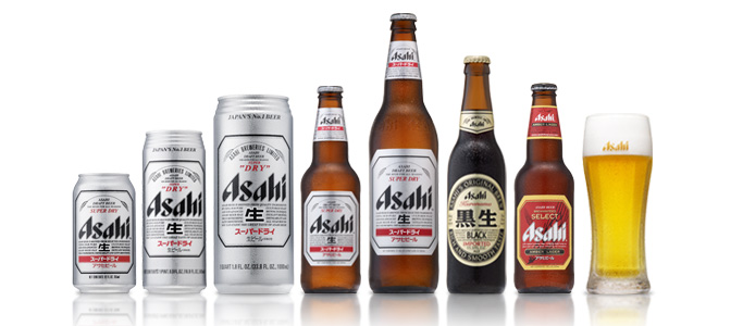
Asahi Breweries is a leading brewery and soft drink company based in Tokyo Japan. In 2009 the company had a 40% share of the Japanese beer market. The company's primary beer from 1957 to the late 80's was Asahi Gold (overtaking Asahi Draft, it's original formula, which remains in production). In 1987 it introduced Asahi Super Dry, which initiated the Japanese craze for dry beer.


Asahi Breweries' HQ in Tokyo were designed by a french designer called Philippe Starck and is considered one of Tokyo's most recognisable modern structures.

I decided to go with a japanese beer brand because I thought I could have fun with the art style since there are a lot of weird and crazy things that are a part of japan's culture that westerners would probably find extremely weird. I think i can use these parts of japanese culture to make my promo and app fun and comical and I can really link the brand to the culture and stereotypes of where it originated from since it's so different to the culture in america or England. I also decided to choose this beer because I feel like it could be popular in Brighton and is related since Brighton tends to celebrate a lot of multicultural festivities and there are usually japanese festivals being held in Brighton every year, there are also plenty of japanese restauraunts in Brighton too which include Asahi beer on their drinks menu.

Existing Adverts for Asahi Beer
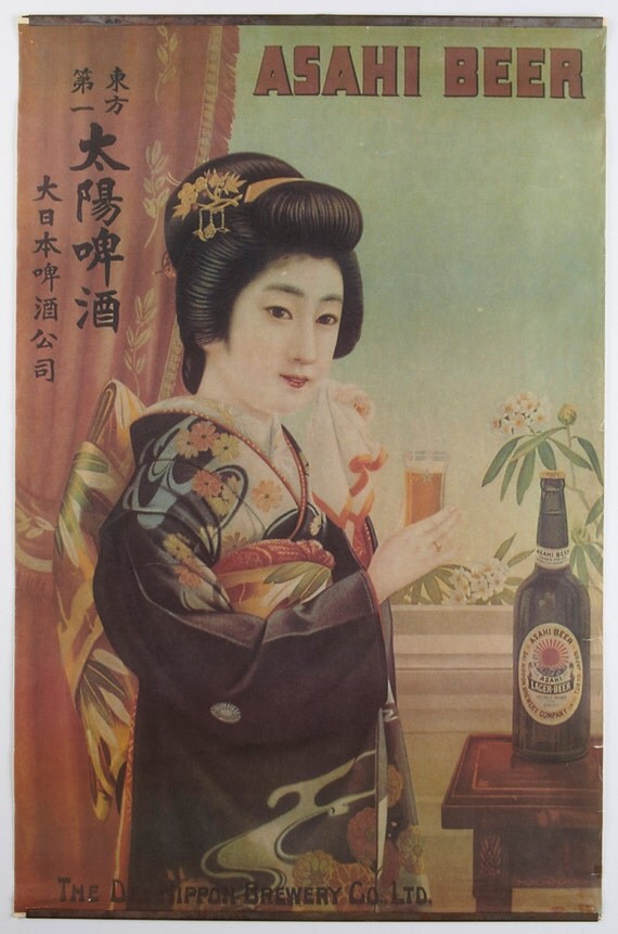
Here are some very old print adverts I found for Asahi Beers. Both posters show a japanese woman holding a glass of Asahi beer, I'm not sure if this is to promote the drink as lager for women or if it is to draw in the male consumers as some of Asahi's other print adverts show the women holding glasses in bikinis on a sandy beach, either way Asahi has always used imagery of pretty women and models to promote their products. The first poster is a vintage print which looks like something that could be advertised around the time of word war 2. The difference between the two posters is also that the print looks far more cultural as the woman is dressed as a geisha in traditional attire and indoors looking quite shy whereas the photographed poster shows a more modernly dressed woman outdoors with a more outgoing smile on her face. I could continue this idea of dominantly using a female figure as a character in the app or promo to promote the brand though I want to take a more modern japanese culture approach and make use of cartoon characters though I may combine modern pop art style with vintage print styles.

Initial thoughts and ideas

Asahi Beer
I have decided that my chosen alcohol brand will be Asahi beer, which is a lager that is marketed as japanese beer. Here are some of my first initial idea related to this brand.
Promoting lager as a women's drink.
HQ is in Tokyo Japan.
Different brands for Asahi:

  • Asahi Draft
  • Asahi Gold
  • Asahi Stout
  • Asahi Z
  • Asahi Black
  • Asahi Prime time
  • Asahi DRY


Ideas for a game type app

  • Fruit ninja inspiration = beer ninja
  • Play as a drunk man going through streets, collect more beers and avoid obstacles
  • A series of random mini games (like wario ware or the game app for 'dumb ways to die')
Ideas for random mini games
  • Cup swapping
  • drink juggling
  • drink chugging
  • pick the odd one out
  • can shooting
Potential themes for art style
  • Japanese pop art
  • Japanese contemporary art
  • Manga/ Anime
  • Historical scroll/ ink prints
  • Animated movies
  • Red line art
  • Simple/ restricted colour scheme
  • decorative/ crowded/ patterned
  • Random characters
  • Takashi Murakami
  • Jon Burgerman?
  • repetitive
  • floral
  • psychedelic
  • comical

Drinks Promotion - The Brief

The Brief
Devise and design an app for both iPad and iPhone which promotes a brand of alcoholic beverage of my choice. The app should be useful, informative or entertaining and related to my chosen brand. Develop a 15 second animation/motion graphics sequence which is a teaser or a promo for the app, to draw in users.
Look into alcoholic brands and advertising, undertake broader visual research which enables me to design a graphic style for use in my animation and app with a cultural focus and set of values suitable to my brand. Create interesting and imaginative visual to bring the brand identity to life. Choose a piece of music to work with for the animation sequence which corresponds to the visual theme, produce story boards and an animatic, use After Effects to produce the finished product.

Research a range of apps for iPad and iPhone as well as interface/interactive design for iPad and iPhone (including usability and gestures). produce a planning schedule for the design (including flow diagrams/ wireframes/ mock-ups). undertake technical research related to design for iPad and iPhone (including resolution/pixel dimensions issues).

Final outcome is an animated demonstration for my app (animatic) which i should pitch to my client, the animated demonstration should have the app mocked-up into an iPad and iPhone graphic shell. Crit work on Monday 9th December.

Justify my design ideas with storyboards, animatic, mock-ups of art works and app interface and content. pitch this on Monday 25th November.

What I need to Submit

  • Pitch presentation of design ideas
  • .mov of animated teaser/promo
  • .mov of 'dynamic visualisation' of the app shown in a graphic of iPad and iPhone
  • Blog of research and development
  • sketchbook of design development