Asahi Breweries
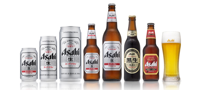
Asahi Breweries is a leading brewery and soft drink company based in Tokyo Japan. In 2009 the company had a 40% share of the Japanese beer market. The company's primary beer from 1957 to the late 80's was Asahi Gold (overtaking Asahi Draft, it's original formula, which remains in production). In 1987 it introduced Asahi Super Dry, which initiated the Japanese craze for dry beer.
Asahi Breweries' HQ in Tokyo were designed by a french designer called Philippe Starck and is considered one of Tokyo's most recognisable modern structures.
I decided to go with a japanese beer brand because I thought I could have fun with the art style since there are a lot of weird and crazy things that are a part of japan's culture that westerners would probably find extremely weird. I think i can use these parts of japanese culture to make my promo and app fun and comical and I can really link the brand to the culture and stereotypes of where it originated from since it's so different to the culture in america or England. I also decided to choose this beer because I feel like it could be popular in Brighton and is related since Brighton tends to celebrate a lot of multicultural festivities and there are usually japanese festivals being held in Brighton every year, there are also plenty of japanese restauraunts in Brighton too which include Asahi beer on their drinks menu.
Existing Adverts for Asahi Beer
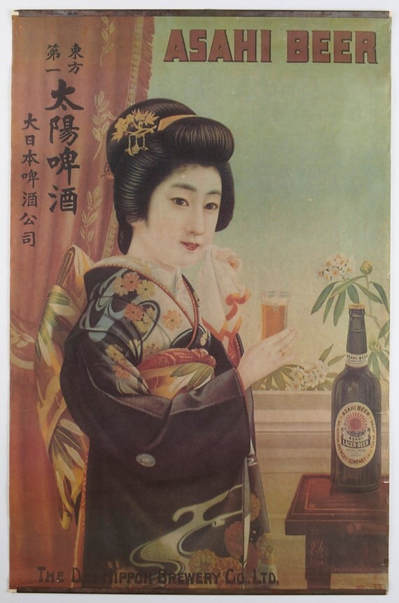
Here are some very old print adverts I found for Asahi Beers. Both posters show a japanese woman holding a glass of Asahi beer, I'm not sure if this is to promote the drink as lager for women or if it is to draw in the male consumers as some of Asahi's other print adverts show the women holding glasses in bikinis on a sandy beach, either way Asahi has always used imagery of pretty women and models to promote their products. The first poster is a vintage print which looks like something that could be advertised around the time of word war 2. The difference between the two posters is also that the print looks far more cultural as the woman is dressed as a geisha in traditional attire and indoors looking quite shy whereas the photographed poster shows a more modernly dressed woman outdoors with a more outgoing smile on her face. I could continue this idea of dominantly using a female figure as a character in the app or promo to promote the brand though I want to take a more modern japanese culture approach and make use of cartoon characters though I may combine modern pop art style with vintage print styles.
Asahi Beer
I have decided that my chosen alcohol brand will be Asahi beer, which is a lager that is marketed as japanese beer. Here are some of my first initial idea related to this brand.
Promoting lager as a women's drink.
HQ is in Tokyo Japan.
Different brands for Asahi:
Asahi Draft
Asahi Gold
Asahi Stout
Asahi Z
Asahi Black
Asahi Prime time
Asahi DRY
Ideas for a game type app
Fruit ninja inspiration = beer ninja
Play as a drunk man going through streets, collect more beers and avoid obstacles
A series of random mini games (like wario ware or the game app for 'dumb ways to die')
The Brief
Devise and design an app for both iPad and iPhone which promotes a brand of alcoholic beverage of my choice. The app should be useful, informative or entertaining and related to my chosen brand. Develop a 15 second animation/motion graphics sequence which is a teaser or a promo for the app, to draw in users.
Look into alcoholic brands and advertising, undertake broader visual research which enables me to design a graphic style for use in my animation and app with a cultural focus and set of values suitable to my brand. Create interesting and imaginative visual to bring the brand identity to life. Choose a piece of music to work with for the animation sequence which corresponds to the visual theme, produce story boards and an animatic, use After Effects to produce the finished product.
Research a range of apps for iPad and iPhone as well as interface/interactive design for iPad and iPhone (including usability and gestures). produce a planning schedule for the design (including flow diagrams/ wireframes/ mock-ups). undertake technical research related to design for iPad and iPhone (including resolution/pixel dimensions issues).
Final outcome is an animated demonstration for my app (animatic) which i should pitch to my client, the animated demonstration should have the app mocked-up into an iPad and iPhone graphic shell. Crit work on Monday 9th December.
Justify my design ideas with storyboards, animatic, mock-ups of art works and app interface and content. pitch this on Monday 25th November.
What I need to Submit
Pitch presentation of design ideas
.mov of animated teaser/promo
.mov of 'dynamic visualisation' of the app shown in a graphic of iPad and iPhone
I went to go look at some animated music videos because it was part of the brief that we had to use sound effects, music or voice overs in our animation so I went to go and observe some to see how timing is effective between the animation and the music.
Gorillaz - 19-2000
The Gorillaz has always been a band that I've liked not only for their music but because all of their music videos are animated which fascinated me when I first saw their music video "Clint Eastwood" on tv in the 90's as a toddler. At that time I didn't pay much attention to the music but to the moving pictures as it was different to the usual cartoons a kid would watch since it had a dreary and dark theme. In the 90's animated music videos weren't very common and the Gorillaz ended up earning an entry in Guinness book of world records for most successful virtual band in 2001. The music videos in which the band appear in consists of an extensive fictional universe depicting this "virtual band" of cartoon characters. The band has four animated members: 2D (lead vocalist), Murdoc Niccals (bass guitar), Noodle (guitar and keyboard), and Russel Hobbs (drums and percussion).
The music video 19-2000 has a mixture of 2D and 3D animation elements which I think works to give scenes some depth, the characters are all 2D and things like the landscape and the car they're all driving in are 3D, I think the vehicle being a 3D animated object also gives the music video a sense of movement and action and make the animation look very smooth. The drawing style of these characters and the world they're in is unique and has a grim aspect as the characters all have a weird design such as crooked or missing teeth, bony hands and fingers with chipped nails and mis matched eye colours. These aspects of the characters make them seem like abnormal and insane or crazy looking which is suitable since the rest of the music video doesn't really use a bright or happy colour palette.
It doesn't seem like the lyrics relate much to whats actually going on in the music video except for some random imagery to a certain word. They've made a lot of use of sound effects to have the animation match well with the music and blend in to the beat of the song such as the car wheels skidding and sound of explosions, which I think works well but the timing of some of the actions in the animation works well with the beat of the music as well, such as in the beginning where Murdoc is flipping his tooth pick with his mouth to the beat of the bass sound or where 2D is snapping his fingers at the same beat as the drums.
Futuristic Imagination
This is a stop motion, paper animation for a japanese pop music video. Pretty much the whole colour scheme for the animation is just white since they haven't used any coloured paper but I think the one colour works because it emphasises the fact that it's all just paper. They've also put in some random desk objects which act as other things for example they've used pencils as missiles and an actual apple instead of a paper one. Unlike other paper-mations i've seen so far which were set against a flat surface this one focuses more on a 3d space by making the people and landscape stand up by folding the paper in a certain way. After looking up the translation of the lyrics I feel like they do relate to whats going on in the music video but might not be obvious or literal to the lyrics. At the end of the music video the lyrics translate to "I'd even cut the roots of our future, and I wouldn't mind" and accompanying it is a scene of the male and female paper figures holding hands after exploding the pencil missiles which could have been seen as the symbolism for their future in this music video. I think the timing of the music with the animation is really synced, there isn't a noticeable beat going through the music video which the animation keeps in time with but it just goes well together. They haven't used any sound effects for this music video but I think it works to put emphasis on the paper aspect of it because paper doesn't make a lot of noise, so I think if they used exploding sound effects for the missiles exploding it might sound out of place with the style of the music.
Daft Punk - Harder, Better, Faster, Stronger
Daft Punk is another band that started in the 90's and in 2003 they released a feature-length animated film called Interstella 5555: The 5tory of the 5ecret 5tar 5ystem. This series of animated videos accompanied an album list of songs and acted as music videos to each of the song's from Daft Punk's Discovery album but when the music videos are linked together in order of the song list on the album they merged into over an hour's long film. The narrative of Interstella 5555 also depict a virtual band of anime style characters in a fictional world in which the style is very electronic and techno-ish and the fashion of the characters is very early 2000's.
The animation goes extremely well with the music as the music has multiple beats in which the actions in the animation move purposely in time with and the tempo of the animation matches really precisely to the song. I think the music and the animation timing just compliments each other really well. It's also very sic-fi themed as the narrative revolves around a band from another planet with an alienated race which pretty much just look like humans with blue skin, and the theme of the cityscape is very futuristic, techy and spacey. The lyrics are very minimal and repetitive but I think it relates to the narrative and actions in the music video because the lyrics are pretty much just "Work it Harder, make it better, do it faster, makes us stronger" and in the animation the alien band have been kidnapped by a record company form earth who are altering and adapting the band members with machines and technology to be made into some kind of popular human band on earth so they can make money from their music and the memories of the band members have been wiped and they're being controlled with these micro chips that have been put on their glasses. So the whole scene is basically emphasising that they're making the band work harder and making them better, faster and stronger by altering them.
Junior Senior - Move your feet
Here is another band that released an animated music video in the 90's I also remember seeing this on tv when I was a kid. The style of this animation is unique in comparison to all of the one's i've seen so far as it's a very pixelated style which looks as if it was drawn in MS paint. This music video has a more hyperactive and energetic theme because the music is upbeat and dancy and the animation consists of a lot of random images of food with faces and people partying. It's also pretty Psychedelic because the colour scheme is bright and flashy and there's a lot of scenes with rainbows and flashing backgrounds. The way I would describe the imagery in this music video is that I imagine all of the scenes look like something someone would see if they were on drugs. The lyrics are highly related to what's going on in the music video since the song is about dancing and party and the whole music video contains relative imagery of people or things being hyperactive. The actions in the animation are also well synced with the beat in the music and the tempo as well as the lyrics and they've used creative typography in some places too such as jam forming a word on toast or bouncing text in the background which adds emphasis to the lyrics.
Video Links:
http://www.youtube.com/watch?v=4IUjtHf76wM
http://www.youtube.com/watch?v=9896cYPaFf0
http://www.youtube.com/watch?v=gAjR4_CbPpQ
http://www.youtube.com/watch?v=SPlQpGeTbIE
These are some other animations I found which I find interesting and could use for some inspiration, some of these are about global warming and some aren't but these are all animations made by amateurs or non professional animators on youtube who put their stuff out on the web.
Saving the Environment
This is a stop animation about helping to save the environment which was made with about 700 chunks of tiny, scrunched up balls of coloured paper and edited in After Effects CS5. The soundtrack was composed and mixed by the you-tuber on Apple Garageband and the sound effects were created by mouth and mixed in Logic Pro. There is no voice over in this animation and The sound track sounds quite minimalist as it uses a repetitive tune and also sounds quite mellow. I prefer that the sound effects were done by mouth rather than taken from sound clips or recording sound clips of the actual sound as I feel it makes the animation seem a bit more comical and gives it that original and home made feel. The elements that are visibly noticeable that were made with After Effects would be the scene where the chainsaw is chopping the tree's down as he's looped the same scene and with after effects he's also put the recycle symbol over the tree and drew a line between the tree and the chainsaw which acts as if it were a wall protecting the tree. I like the look of the scrunched up paper as I think it's original and a unique visual style and it also sends through the message it's trying to deliver because it looks as if the animation was made by using recycled scraps of coloured paper itself. The animation doesn't use any text apart from the 'O2' made out of paper which comes out of the tree. The colour scheme is mostly green, brown, blue and white which i've noticed is quite common for animated commercials and videos about global warming as they're earthy and aquatic colour relating to nature, forests and the sea as well as the things living in both of those areas. I don't think there is a specific message being sent across accept for to save the environment but the message is very vague. There are some elements that suggest that people should recycle because there is a recycling bin and the recycling symbol appears more than once. I think the transitions in the stop motion itself are interesting such as the tree exploding out text and it zooming into the text making it look like a background and the water drop from the tap which changed into the image and shape of the world.
Stop Motion Paper Animation
I found this other stop motion animation which is also made out of paper except rather than scrunched up paper or objects made out of paper it's more like cut out stencils or like the style of a pop up book. The colour scheme in this is dominantly red and white which i think works since the animation is of an apple tree growing. The white is obviously to show it is made of paper but also i feel like it gives off some sense of purity and cleanliness as if there tree was grown in a completely unpolluted area. The red is for the apples only but I think against the white it makes the apples look healthy and ripe. There is no voice over or sound effects in this animation, only a sound track which has a steady pace and a repetitive tune. This animation also has a homemade feel and theme especially because at the beginning and end it shows the paper crafted tree on a wooden desk surrounded by stationary and tools like scissors and pens.
Littering
This is a flash animation made by a you-tuber about littering and recycling. It's a hand drawn animation made with adobe flash and isn't all that informative about global warming or the effects littering has on the environment but is more like a short story of how he's picky about littering and recycling which he has roughly animated and illustrated. I think this kind of animation can be a bit more humorous, casual and cartoony because it wasn't made by a professional but I think it's also an effective way to somewhat inform an audience about littering and recycling in a casual way because many young people spend time viewing videos on youtube. There's voice overs for the characters in the animation which were done by the animator and there is also a soundtrack in the background which sounds casual and easy going but there are no sound effects except for at the end where he opens and closes a door. He's also used puns in the dialogue which I think if it was applied to an animation delivering a serious message about global warming it could lighten the mood and tone and he uses text at the end to make his point which is "Don't litter. And also recycle". There is no consistent or dominant colour scheme here and the style doesn't have much detail as they're simple drawings with minimal shading, thick lines and no textures.
This is an animated video about how food waste is recycled by RecycleNow. I think this video is a good animation for me to look at first as it is highly related to the topic I want to cover in my animation and will be a good start to inspire my own animation. I like the drawing style of this animation because it's quite simple and line less using only block colours to distinguish shapes and objects and using no source of light and shadow. The animation looks quite simple with objects only rotating or moving along all in one direction or things easing or fading in and out, It's not as complicated as something such as an animated person which would have individual moving limbs. The style of it also has a hand drawn feel about it because of the way the blue smiley face was animated as if a pencil had drawn out the lines. The colour scheme is very earthy using mostly green, brown and beige and steers away from being too dark as they avoid using harsh shades like black and instead use their darkest colour as a navy blue in places where you would usually imagine black being used. They've also used yellow and different shades of blue which are colours that can be associated with sunshine and clean water, I would assume these colours would symbolise the environment getting better and becoming richer, cleaner and a healthier place to live in. The soundtrack is an instrumental and uses soft sounding instruments and sounds such as acoustic guitar and xylophones and other things. It sounds very much like a casual background track as it's not upbeat or too slow but just has a steady and comfortable pace. It doesn't have any sound effects but uses a voice over of a man talking and giving information that goes with the animation, his voice sounds like a friendly mid tone male voice with a little enthusiasm and a welsh accent. They also have one on how garden waste is recycled which follows a similar theme and the same soundtrack. The voice over in this one is a slightly deeper sounding male voice with a british accent. It can be found here: http://vimeo.com/15661770
Recycle Now - Plastic Bottles - How are they recycled
This is another animation for Recycle Now about how plastic bottles are recycled and encourages the public to participate in recycling. Unlike the Food waste animation this one is much shorter by almost a whole minute. The art style and simplicity of the animation is pretty much the same and uses the same sound track and british voice actor for the voice over. It's also more to the point about what are the uses of recycling plastic bottles and what other useful things they can be recycled into such as, plastic bags, fencing or more plastic bottles. It also briefly explains how they are recycled, such as separation from other trash, sorted by colour, cleaned, shredded, melted into pellets etc.
Save Our World
The style of this animation looks as if it was a made like a paper animation even though it was digitally made, the textures and colour and the way it was animated make it look as if all the objects were collaged and made out of scrap pieces of paper. This is the kind of style I would like to animate my own animation in with the paper craft kind of look and movement. I think this kind of style is very effective for a topic about being eco friendly and doing activities like recycling because the animation looks as if it was recycled itself from paper, it looks organic and original and as if it was made with hands and not machines. This animation also has a deep male british voice over and sound effects such as birds tweeting, wind blowing, rain falling and crickets chirping at night. They have also used a sound track which sounds like a minimalist instrumental and uses a repetitive tune. They also use researched and factual information in this animation as random facts by having the voice actor say "did you know?-" and they would have him read out a fact which is also displayed as text on the screen. I think this is useful as it's not only delivering a message throughout the animation but also stating the facts about the effects it has now and could have on the world in the future. Some of these facts sound intimidating though the voice actor doesn't speak in an intimidation tone but I think it would have the audience worry about the future and act upon on it. It also encourages to do thing as a family and to get your friends involved too and lists a variety of different activities you can take part in to help such as recycling, reducing waste and changing the amount of things you buy and don't need.
EDP Commercial
This is an animated commercial for EDP by Jessica Walsh. Unlike the previous animated commercials the voice over is a mature female's voice with an american accent and a calm, tone. They also use a soundtrack that has lyrics which is different because the previous animations used instrumental music for the background. Though They haven't made much use of sound effects and I think this is because their background music includes lyrics and having sounds effects would just sound like there's too much going on and could be distracting to the main message being delivered by the voice over. I like the colour scheme and style of this animation as the whole thing is very minimal such as the restricted colour palette being only white, red and some grey and all of the objects in the animation were made only by basic shapes such as circles, squares, triangles, semi circles etc. and they haven't used overly complicated shaped that are created by a hand drawn style and they've kept it simple instead. I think this style works well because it looks clean, crisp and very modern and there is also a strong contrast between the red and white. I think it sends a different message across compared to the other animations because it doesn't talk much about what the audience can do to make a different or the effects global warming is causing, instead they mainly talk about their company and what they do but I don't think it sends across a strong enough message that makes other people want to participate in reducing co2 emissions.
The visual style and theme of my animation and the artwork in it is massively inspired by a series of games I used to play from when I was a teen until now. All of these games fall into the same genre of games which is usually a sort of time consuming or 'time wasting' games where the main theme is usually centred around something that seems like everyday life and an addiction to collecting items.
This specific theme of gaming will be described in more detail as I talk about the visual style of the following games that inspire my animation.
Harvest Moon Series
The Harvest Moon games have been around since 1996 and follow a re-occurring theme of farm simulation and role playing game where you start off playing as a character (in which you can name and choose the gender of) who has moved into a new town to work and live as a farmer. The farm that you move into is bare, small and has no farm animals or crops, only a house and some fields with poor soil. The entire town is also in poor condition and has few villagers and has been this way since the death of what is known as the harvest tree and the Harvest goddess who looked after the tree and the land around the town. The harvest tree withered due to the villagers not taking care of the town and nature and taking the tree for granted (as if they were creating co2 emissions) by littering, cutting down trees etc.
Throughout the game your goal as a farmer is to revive the harvest goddess and bring life back to your town and the farm by growing your own crops, using fertilisers to make the fields on your farm richer, building your own coop and barn for livestock and poultry and shipping produce made on the farm. You can also socialise with the villagers and your character can even marry one of the bachelors or bachelorettes by building up their hearts. As the condition of the town improve during the time it takes for you to revive the harvest goddess more people move into the town and more areas of the island open up for you to explore.
I love the art style for this game because they use simple colours and textures and it has a cute visual. This makes the characters and the overall style of the game seem friendly which is what I want my animation to look like. Rather than an intimidating message with an accusing tone or making the issue seem like something that is incredibly serious I want it to reach out to the viewers with more of a friendly message or offer for a better future. The colour scheme is also very earthy and fresh because they don't use any bold striking colours such as hot pink or other luminous colours. The design of my eco friendly character for my animation will be similar to the style of the characters in this game. Unlike the rest of my animation which has a collage kind of style my character will resemble this style more as I want her to stand out against the patterned elements and not get lost within all the other objects in the animation.
Rune Factory Frontier
Rune Factory is another series of games who's art style inspires me. The concept behind the Rune Factory games are very similar to Harvest Moon's as both games are made by the same company except Rune Factory has fantasy themed twist throughout the games and includes more fantasy themed aspects to it. For example this game keeps the same idea of farming and revival of the land except you can also go to areas such as forests and dungeons and fight monsters as well as capture ones that can be raised and trained as livestock on your farm. There's also the fantasy element of different races of humanoids such as elves, humans and witches and wizards. The Producer of Harvest Moon and Rune Factory describes this game as "Harvest Moon where you wield a sword."
What I like about the artwork from both harvest moon and Rune factory is that they make the whole farming idea a big theme and there's always imagery of crops and plants which relates to the idea of my animation of growing your own food. I also like how in this particular image the whole outer edge of the group of characters and food have a stroke of brown cork or wooden texture instead of just a thick outline of a solid colour. I may use this idea in my own animation to outline maybe my eco friendly character or the vegetables that are growing as I think this little detail looks very organic and unique. The art style in both games is very much like manga or anime style artwork which has always been a big influence on my drawing style although I think for this animation i'm more drawn to the less proportionate and detailed style of the harvest moon characters which look short chubby and have round faces with simple face expressions as I think that style would be easier and quicker to draw and goes better with the collage theme of the rest of my animation. I really like the detail in this style with the colouring such as on the crops ,the textures are soft and I like how on the strawberries they use patches of lighter and darker reds to make it look like it has that bumpy texture a strawberry has from having loads of seeds indented into it. I also like how they used a similar technique on the corn and grapes instead of outlining every individual grape or corn and using the colours to define the texture and shape of the food instead.
Animal Crossing
Animal Crossing is another game I used to play which follows a similar time wasting, life or community simulation themed game. Unlike Harvest Moon and Rune Factory which centres around farming and nurturing the environment, Animal Crossing is more of a game about collecting. The player lives in a village inhabited by talking animals that live their lives as if they were humans, carrying out various activities. The series is unique for its open-ended gameplay and progress forward using real time gameplay (use of the game systems' internal clock and calendar to simulate real passage of time).
I think the art style in this game would probably be more appealing if my animation was more aimed at children as the characters are more simply drawn and have a more humorous look to them because they have weird facial expressions. The colour palette is also extremely bright and uses shocking 'in your face' colours like neon green and orange and bright blue, this kind of colour palette would likely appeal more to children though for my animation I would like to use a more muted and earthy colour palette for that organic and eco friendly look. Though I can agree that this game probably has the easiest art style to replicate and re draw I'm not sure if it will work with my theme and against the collaged patterned elements in the rest of my animation. On the other hand the Animal Crossing series has taken my interest in their original sound tracks so I'm most likely to use a soundtrack from one of the games as an option for the background music in my own animation.
Ragnarok Battle Offline
Ragnarok Battle Offline, or RBO, is a 'beat 'em up' game for Microsoft Windows, It is a homage and spoof of an online RPG game I used to play called Ragnarok Online. This game is a much different theme and genre compared to the 3 games above which were all life simulation games but the art style of this game has some similar features to the ones above. Ragnarok Battle is a multiplayer fantasy fighting game where you pick to play as a character out of 7 job classes (Novice, Magician, Archer, Acolyte, Swordsman, Thief and Merchant) and advance through levels by yourself or with 3 other players, killing monsters collecting money and dropped items and fighting bosses.
What I like about this art style is it looks quite similar to the harvest moon style with the short chubby and round faced look but looks more 2D and has a simpler way of drawing the faces and facial expressions, I don't like the look of the big ears though so I won't include that as part of the style of my eco friendly character if I decide to draw inspiration from this game's art style. I may combine the style of Harvest Moon with the style of Ragnarok such as using the same body style and colouring style from Harvest Moon but using the faces from the characters of Rangarok Battle.
I came across this French artist called Annette Marnat. She works as an illustrator for french and international publishers and for animated pictures as a designer. I really like her style as I think it is similar to other artists or images i've seen that have inspired my own personal style.
I really love how this images focuses on the girl with the umbrella by putting her against a plain background colour that contrasts with the colour of her clothes and the umbrella. It doesn't distract you from the subject of the image by putting her against a complicated and detailed background. The pastel blue background works because it's a cold colour which can signify dull or rainy weather without having to illustrate actual rain drops or puddles. The overall artwork doesn't have any line art either to outline any objects which I think makes the girl look softer and also gives the image a semi-realistic style. I also like the texture given by the darker coloured brush strokes as I feel it relates to my own hand drawn style when i've used illustrator on past projects and used brush strokes to make up my artwork and give it form and texture.
This illustration is different to the first one as the theme, colours and the way it was drawn has a dramatic contrast. While the visual style of how she draws people is still similar the piece has a completely different feel, theme and colour scheme as well as the way it is textured. Unlike the previous image which has a hand painted feel like it was painted onto a canvas, this image looks more as if it was painted digitally because of the bolder outlines and edges of strokes. The colour scheme is much darker varying mostly from black to dark teals. The patterned background fades from a dark teal to a lighter teal from top to bottom. There is also the pop of the much lighter blue colour of her tights which make her legs stand out against the rest of the dark image and make the subject appear taller. Rather than using brush stroke for shading they have used shapes of one colour darker than the base colour to use as shadow to define the form of the subject and give her structure more depth and a more 3D form. The subject in this image also has been more defined with black outlines, making it look more cartoony.
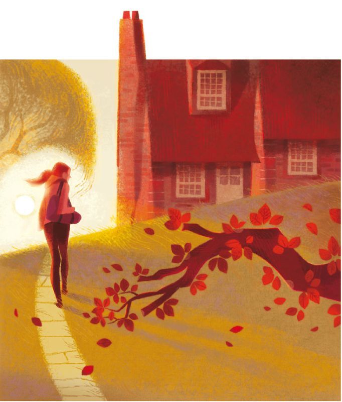
This illustration goes back to that textured, hand painted, brush stroke style and uses warm autumn colours like reds, browns and yellows. What i've noticed about this image is that is have a quirky aspect to it which is how the chimney on the house looks as if it is poking out of the top of the painting. I'm not sure what kind of effect this is supposed to have but to me it somehow feels awkward being there and I feel like it makes me want to crop it off from the rest of the painting. I also like the use of foreground and background objects too in this image like the tree branch at the front and how the house and tree are at the back with the girl in between, I think it gives the painting more depth of field. I also like how naturally shadows fall in the image since I usually have trouble drawing shadows that are being cast by a light source which in this image would be the sun on the left of the girl and the shadows stretching in the opposite direction. I think this painting has a very warm and cosy theme.
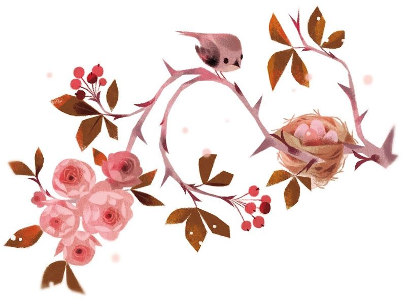
In comparison to the previous image this one has a winter theme. It also looks as if it has been painted digitally like the 2nd image but also has the soft style of not having line art or harsh lines to define edges. Even though the typical cold colours haven't been used such as blue, purple and white it still has a cold colour scheme as the pinks look dusty and muted and they have used greyish brown tones which give the look of frosted branches. There are also some random white and beige spots scattered around which give the impression of winter snow. I really like the shape of the image and the way the branches curve up and curl down and around as it looks more decorative. The imagery of the birds nest with the eggs and the cute, small bird who is supposedly the mother of those eggs as well as the blooming flowers bring warmth and life into the cold theme of the painting.
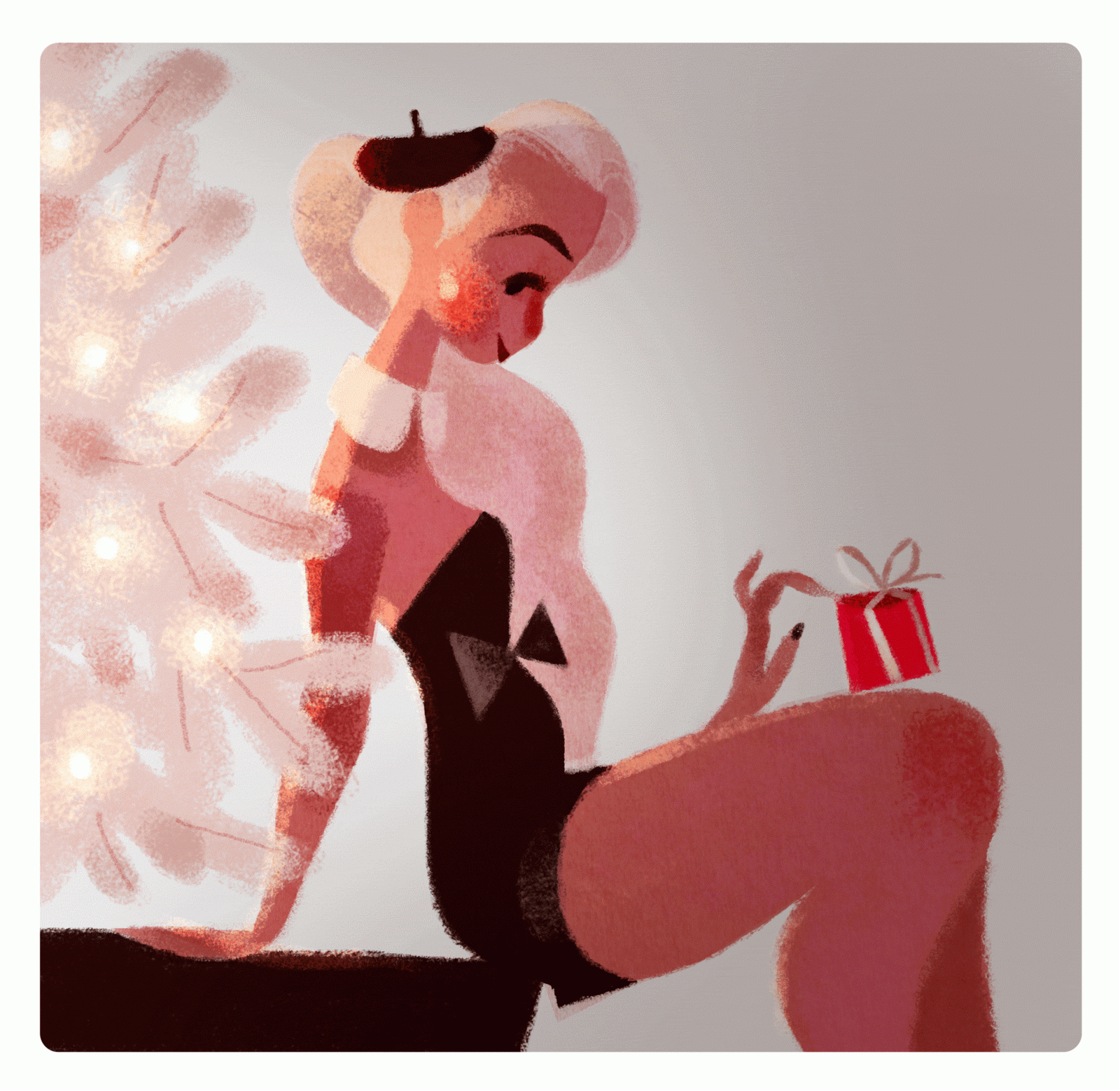
This is the only image by Marnat that I could find that was somewhat animated. This is a gif she made of a classy looking girl sitting next to a white tree with lights and holding a wrapped gift in her hand. from those elements of the gif It would be natural to assume this has a christmasy theme, I would also say that this gif is very french themed as the girl in the image is wearing a small black beret and slim black dress with a bow which gives the image a romantic christmas feel and france is usually associated with romance. The lights on the tree blink on and off and reflect /shine against the girl's skin and hair. I also like the minimal colour scheme of just black white and skin tones, I think it looks very chic and clean and again associates with the stereotype of the black and white striped shirts supposedly worn by french people. I also like the texture in this gif as it looks more like a grainy or spray painted texture instead of the usual brush strokes that she uses in her work.
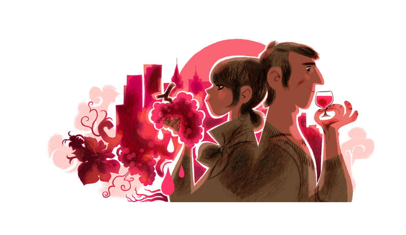
This image also has a romantic theme to it because of the couple standing back to back and wearing clothes that are the same colour. The hot pink and red colour scheme used for the background and reflecting like light off the couple also looks passionate and are colours associated with romance and love. The bunch of grapes and the glass of wine also carried by the couple is iconic to a fancy or classy dinner between couples and can be associated with fine dining. I also like how the shapes of the grapes and leaves at the bottom of the background blend in with the buildings of the cityscape as it looks quite stylistic.
This next illustration shouts disney to me. I feel like it resembles themes in many disney princess movies like Cinderella, Sleeping Beauty, Snow White or Tangled, where at the beginning of the films the heroines are usually at home with a poor lifestyle where they have to work as a servant or a maid and have to do chores like cooking and cleaning although during those scenes they still seem to enjoy themselves, I feel like this image resembles a similar scene. The dress of the girl reminds me of the tattered outfit Cinderella wears at the beginning of the movie and the red apples are iconic to Snow White whilst the girls hair is long and somewhat resembles Rapunzel.