Asahi Breweries
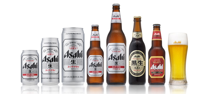
Asahi Breweries is a leading brewery and soft drink company based in Tokyo Japan. In 2009 the company had a 40% share of the Japanese beer market. The company's primary beer from 1957 to the late 80's was Asahi Gold (overtaking Asahi Draft, it's original formula, which remains in production). In 1987 it introduced Asahi Super Dry, which initiated the Japanese craze for dry beer.
Asahi Breweries' HQ in Tokyo were designed by a french designer called Philippe Starck and is considered one of Tokyo's most recognisable modern structures.

I decided to go with a japanese beer brand because I thought I could have fun with the art style since there are a lot of weird and crazy things that are a part of japan's culture that westerners would probably find extremely weird. I think i can use these parts of japanese culture to make my promo and app fun and comical and I can really link the brand to the culture and stereotypes of where it originated from since it's so different to the culture in america or England. I also decided to choose this beer because I feel like it could be popular in Brighton and is related since Brighton tends to celebrate a lot of multicultural festivities and there are usually japanese festivals being held in Brighton every year, there are also plenty of japanese restauraunts in Brighton too which include Asahi beer on their drinks menu.
Existing Adverts for Asahi Beer
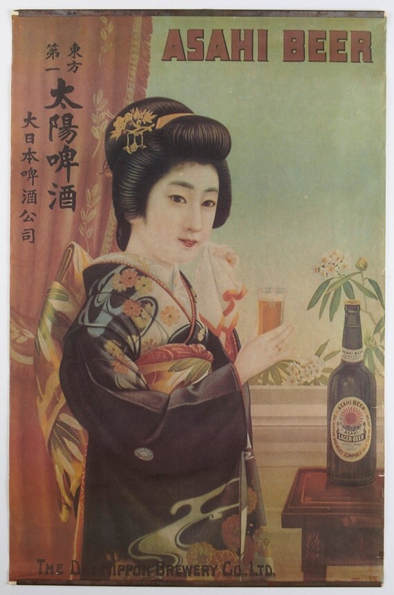
Here are some very old print adverts I found for Asahi Beers. Both posters show a japanese woman holding a glass of Asahi beer, I'm not sure if this is to promote the drink as lager for women or if it is to draw in the male consumers as some of Asahi's other print adverts show the women holding glasses in bikinis on a sandy beach, either way Asahi has always used imagery of pretty women and models to promote their products. The first poster is a vintage print which looks like something that could be advertised around the time of word war 2. The difference between the two posters is also that the print looks far more cultural as the woman is dressed as a geisha in traditional attire and indoors looking quite shy whereas the photographed poster shows a more modernly dressed woman outdoors with a more outgoing smile on her face. I could continue this idea of dominantly using a female figure as a character in the app or promo to promote the brand though I want to take a more modern japanese culture approach and make use of cartoon characters though I may combine modern pop art style with vintage print styles.
No comments:
Post a Comment