I came across this French artist called Annette Marnat. She works as an illustrator for french and international publishers and for animated pictures as a designer. I really like her style as I think it is similar to other artists or images i've seen that have inspired my own personal style.

I really love how this images focuses on the girl with the umbrella by putting her against a plain background colour that contrasts with the colour of her clothes and the umbrella. It doesn't distract you from the subject of the image by putting her against a complicated and detailed background. The pastel blue background works because it's a cold colour which can signify dull or rainy weather without having to illustrate actual rain drops or puddles. The overall artwork doesn't have any line art either to outline any objects which I think makes the girl look softer and also gives the image a semi-realistic style. I also like the texture given by the darker coloured brush strokes as I feel it relates to my own hand drawn style when i've used illustrator on past projects and used brush strokes to make up my artwork and give it form and texture.
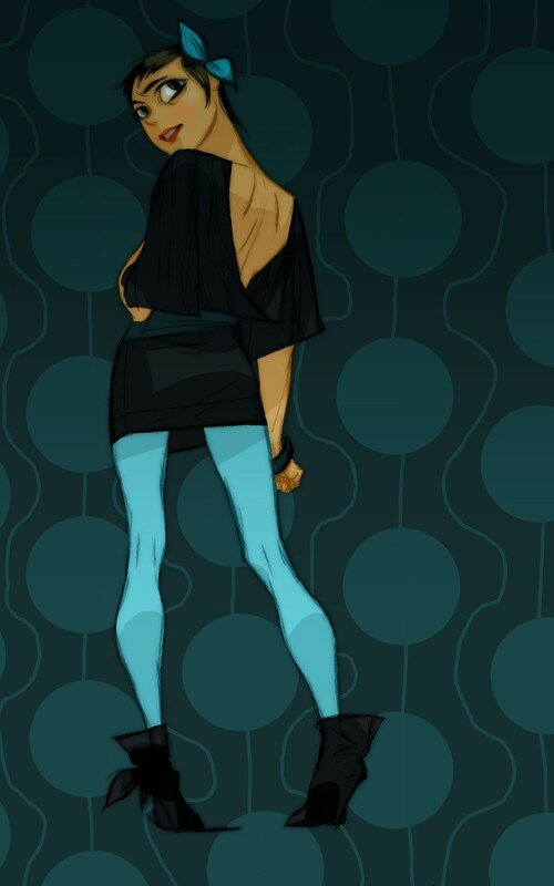
This illustration is different to the first one as the theme, colours and the way it was drawn has a dramatic contrast. While the visual style of how she draws people is still similar the piece has a completely different feel, theme and colour scheme as well as the way it is textured. Unlike the previous image which has a hand painted feel like it was painted onto a canvas, this image looks more as if it was painted digitally because of the bolder outlines and edges of strokes. The colour scheme is much darker varying mostly from black to dark teals. The patterned background fades from a dark teal to a lighter teal from top to bottom. There is also the pop of the much lighter blue colour of her tights which make her legs stand out against the rest of the dark image and make the subject appear taller. Rather than using brush stroke for shading they have used shapes of one colour darker than the base colour to use as shadow to define the form of the subject and give her structure more depth and a more 3D form. The subject in this image also has been more defined with black outlines, making it look more cartoony.
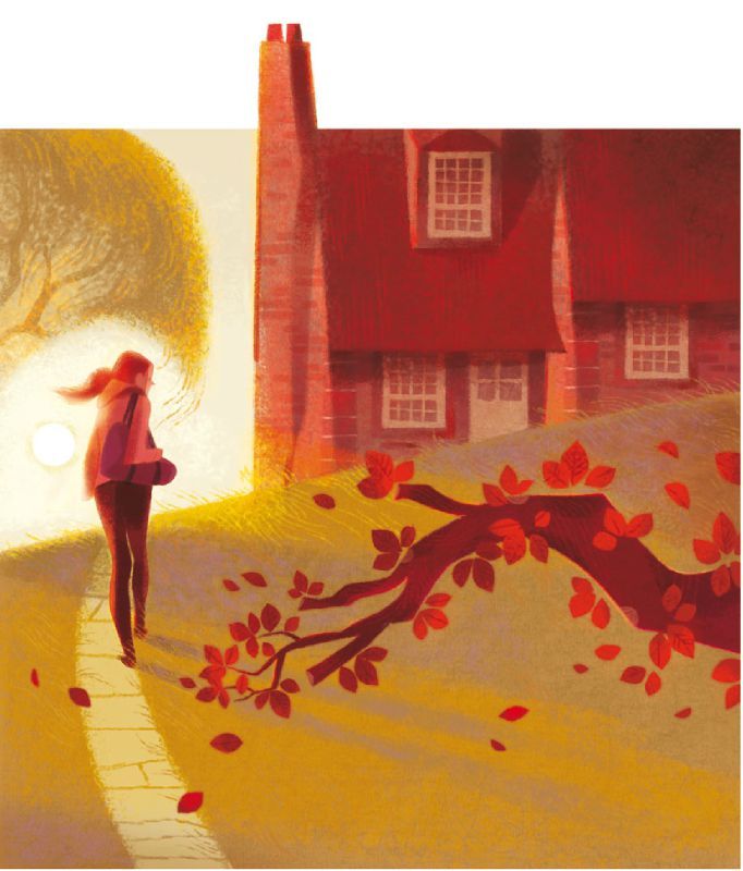
This illustration goes back to that textured, hand painted, brush stroke style and uses warm autumn colours like reds, browns and yellows. What i've noticed about this image is that is have a quirky aspect to it which is how the chimney on the house looks as if it is poking out of the top of the painting. I'm not sure what kind of effect this is supposed to have but to me it somehow feels awkward being there and I feel like it makes me want to crop it off from the rest of the painting. I also like the use of foreground and background objects too in this image like the tree branch at the front and how the house and tree are at the back with the girl in between, I think it gives the painting more depth of field. I also like how naturally shadows fall in the image since I usually have trouble drawing shadows that are being cast by a light source which in this image would be the sun on the left of the girl and the shadows stretching in the opposite direction. I think this painting has a very warm and cosy theme.
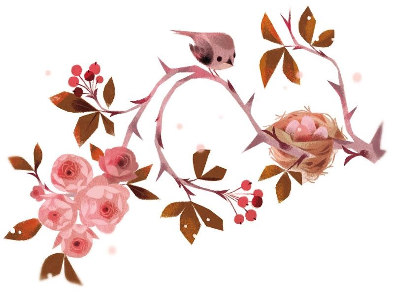 In comparison to the previous image this one has a winter theme. It also looks as if it has been painted digitally like the 2nd image but also has the soft style of not having line art or harsh lines to define edges. Even though the typical cold colours haven't been used such as blue, purple and white it still has a cold colour scheme as the pinks look dusty and muted and they have used greyish brown tones which give the look of frosted branches. There are also some random white and beige spots scattered around which give the impression of winter snow. I really like the shape of the image and the way the branches curve up and curl down and around as it looks more decorative. The imagery of the birds nest with the eggs and the cute, small bird who is supposedly the mother of those eggs as well as the blooming flowers bring warmth and life into the cold theme of the painting.
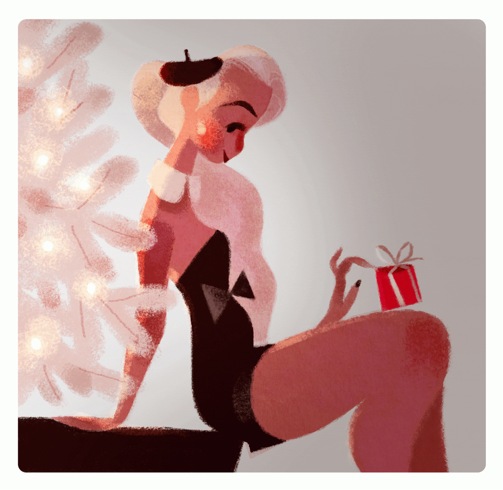 This is the only image by Marnat that I could find that was somewhat animated. This is a gif she made of a classy looking girl sitting next to a white tree with lights and holding a wrapped gift in her hand. from those elements of the gif It would be natural to assume this has a christmasy theme, I would also say that this gif is very french themed as the girl in the image is wearing a small black beret and slim black dress with a bow which gives the image a romantic christmas feel and france is usually associated with romance. The lights on the tree blink on and off and reflect /shine against the girl's skin and hair. I also like the minimal colour scheme of just black white and skin tones, I think it looks very chic and clean and again associates with the stereotype of the black and white striped shirts supposedly worn by french people. I also like the texture in this gif as it looks more like a grainy or spray painted texture instead of the usual brush strokes that she uses in her work.
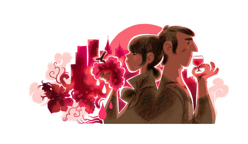 This image also has a romantic theme to it because of the couple standing back to back and wearing clothes that are the same colour. The hot pink and red colour scheme used for the background and reflecting like light off the couple also looks passionate and are colours associated with romance and love. The bunch of grapes and the glass of wine also carried by the couple is iconic to a fancy or classy dinner between couples and can be associated with fine dining. I also like how the shapes of the grapes and leaves at the bottom of the background blend in with the buildings of the cityscape as it looks quite stylistic.
 This next illustration shouts disney to me. I feel like it resembles themes in many disney princess movies like Cinderella, Sleeping Beauty, Snow White or Tangled, where at the beginning of the films the heroines are usually at home with a poor lifestyle where they have to work as a servant or a maid and have to do chores like cooking and cleaning although during those scenes they still seem to enjoy themselves, I feel like this image resembles a similar scene. The dress of the girl reminds me of the tattered outfit Cinderella wears at the beginning of the movie and the red apples are iconic to Snow White whilst the girls hair is long and somewhat resembles Rapunzel.
No comments:
Post a Comment