Showing posts with label Propaganda Poster Project. Show all posts

Friday, 9 November 2012

Final Design and Reflection

This is the final version of my poster. I am pretty happy with it though I wish I could of adapted more on my illustrator skills other than just using the pen and brush tools and live trace. I would of liked to explore more on how I can make the text look better as I originally wanted a texture on my grey text but I couldn't figure out how to do it.

I realised a mistake that I made was making my poster in the wrong size (A4) which then caused problems for me and was a pain to try and stretch it to A1 size without losing the quality of it and messing up the brush strokes.

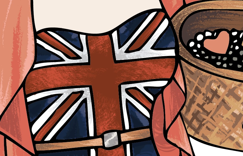
With this project I felt a bit limited to design choices as I found it difficult to come up with several designs that are all based on the same poster, without losing too much of the historic reference to the original poster. I couldn't think of anything to change besides the person and the trinkets, I think changing the background would to taken too much away for it to relate to the original poster.

I think something I need to take intro consideration next time I use illustrator is to always start in the right size and to group things. I'd like to perhaps try using gradient mesh next time and exploring more with things like scatter brushes and making text look good.


Thursday, 8 November 2012

Poster Progress 2 - Artistic Brushes

I Have locked all of my layers and made new ones naming them after each fill colour on my poster. I've done this to separate the shading of different objects within my poster so that it can be easier to change things, blend thing or move them behind or in front of each other.

I wanted my poster to look hand painted and textural so to give my poster some shape and texture I used the ink and chalk brushes because water colour brushes appear to be too light against my dark base colour. These were the 3 main chalk brushes I used, changing the size smaller and the colour darker to create folds and creases in the clothes without having to draw obvious crease lines and creating highlights. When shading I tend to use 4 colours, the base colour, 2 darker colours and one lighter colour so that I can blend them well together and the lines appear softer and not too harsh.

I just kept repeating this process adding new layers and kept shading and eventually things started to take a lot more shape and look much more detailed. I used the same method to texture the hair, skin, eyes and the soil in the background. I also drew in the bushes from the original poster using the same colours and using water colour brushes again.


Poster Progress 1

I first started by scanning in a clean line art drawing of the girl and trinkets for my design and opened it up in illustrator. I used the live trace option to convert the outlines of my drawing from a bitmap to vector image. Using the live paint bucket tool I then started to fill in the the basic base colours for my poster on the same layer as the live tracing. 

I also had duplicated the live trace layer before I started filling the colours in and locked it so that I could shade in between both of them and the shading would go on top of the colour fill and behind the line art. I made a new layer and called it 'Skirt colour' and using the water colour brushes which appear very light, I started shading the skirt with greys and also using the blue from the upper half of the dress, and light washes of the red colour from the dress too to create shadows and highlights making the skirt appear more flowing and 3D and adding texture.
 
When I was finished with shading my skirt I locked the layer and added a new one. I used this layer to make fills using the pen tool to cut out the part of the shading that went over the outline of the skirt.