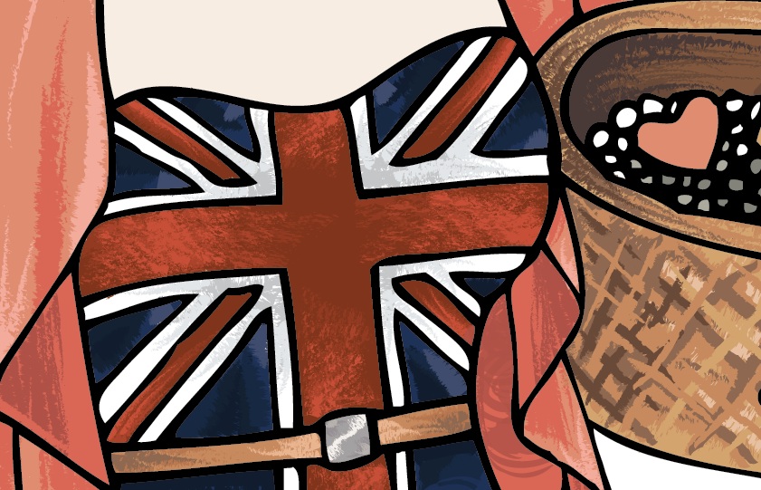
I wanted my poster to look hand painted and textural so to give my poster some shape and texture I used the ink and chalk brushes because water colour brushes appear to be too light against my dark base colour. These were the 3 main chalk brushes I used, changing the size smaller and the colour darker to create folds and creases in the clothes without having to draw obvious crease lines and creating highlights. When shading I tend to use 4 colours, the base colour, 2 darker colours and one lighter colour so that I can blend them well together and the lines appear softer and not too harsh.
 I just kept repeating this process adding new layers and kept shading and eventually things started to take a lot more shape and look much more detailed. I used the same method to texture the hair, skin, eyes and the soil in the background. I also drew in the bushes from the original poster using the same colours and using water colour brushes again.


No comments:
Post a Comment